

New Zealand Post's Courier Sortation Facility
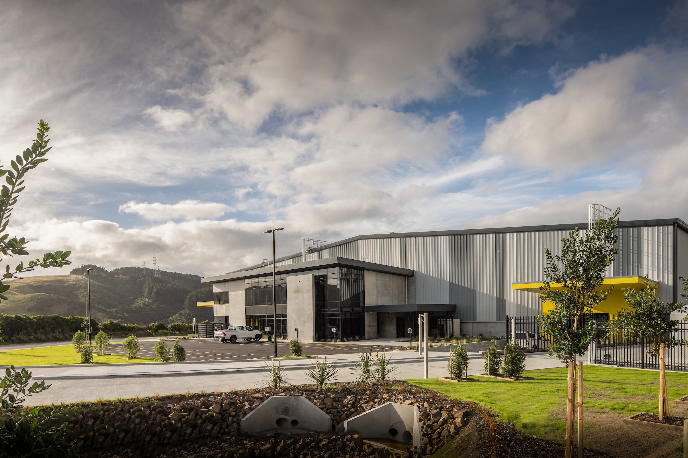
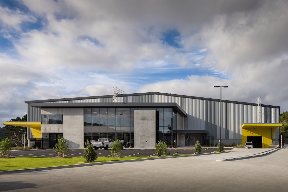
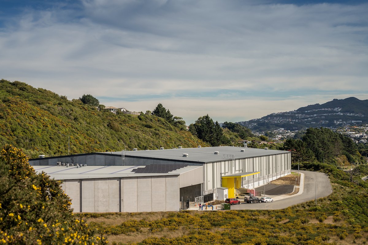
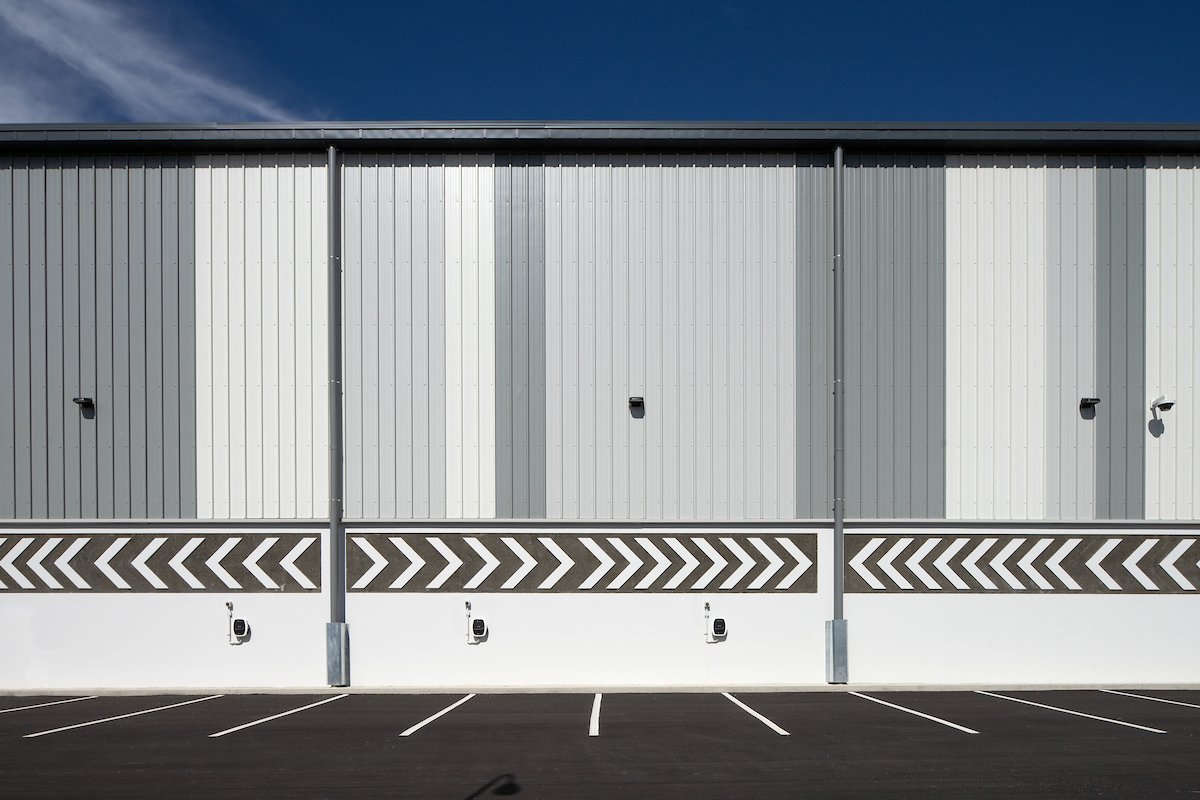
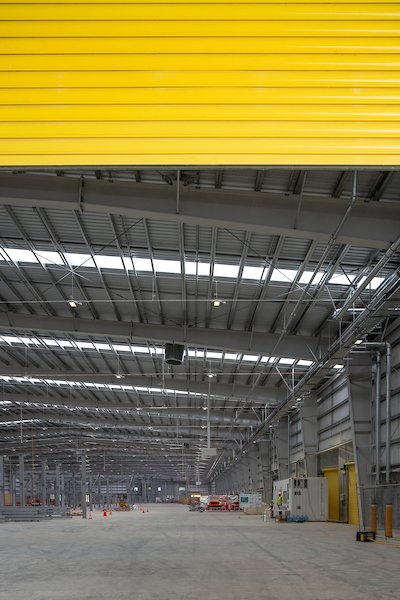
New Zealand Post's Courier Sortation Facility, newly located in Grenada.
The 10,690m² depot will support the growth of New Zealander's online purchasing, with technology that will sort and scan parcels at a much faster rate than current.
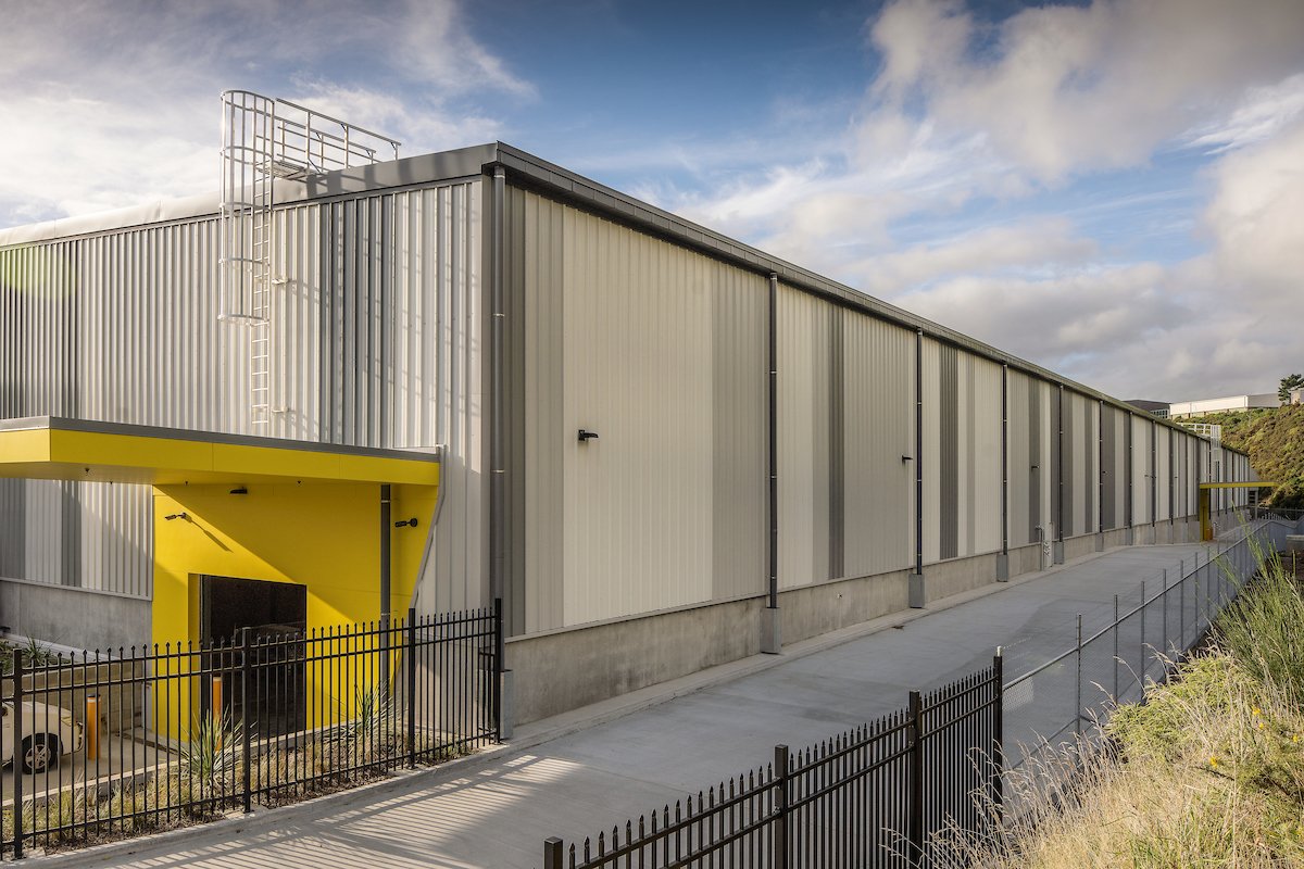
The depot was designed with alternating metal profiled cladding to break the dominance of the large form from State Highway 1. The accents of yellow highlight the main entrances for way finding.
woodward street - wellington
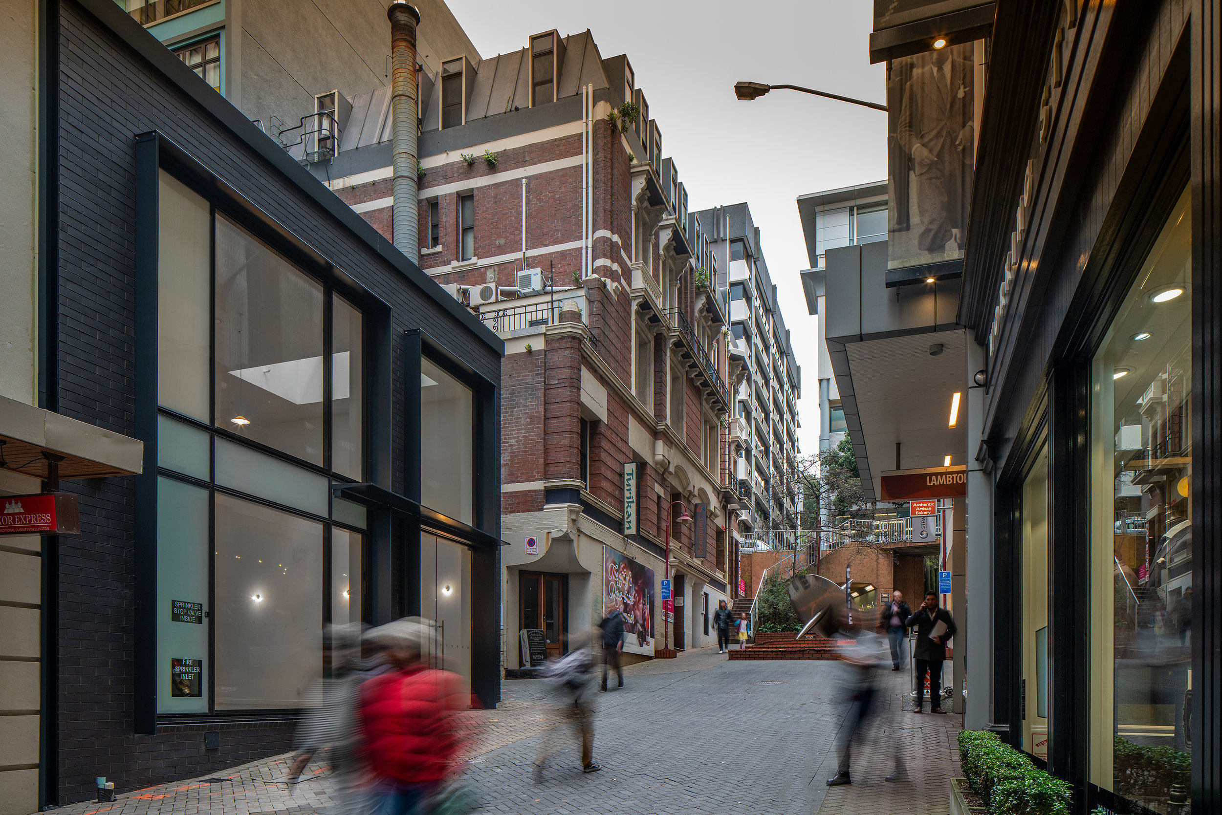
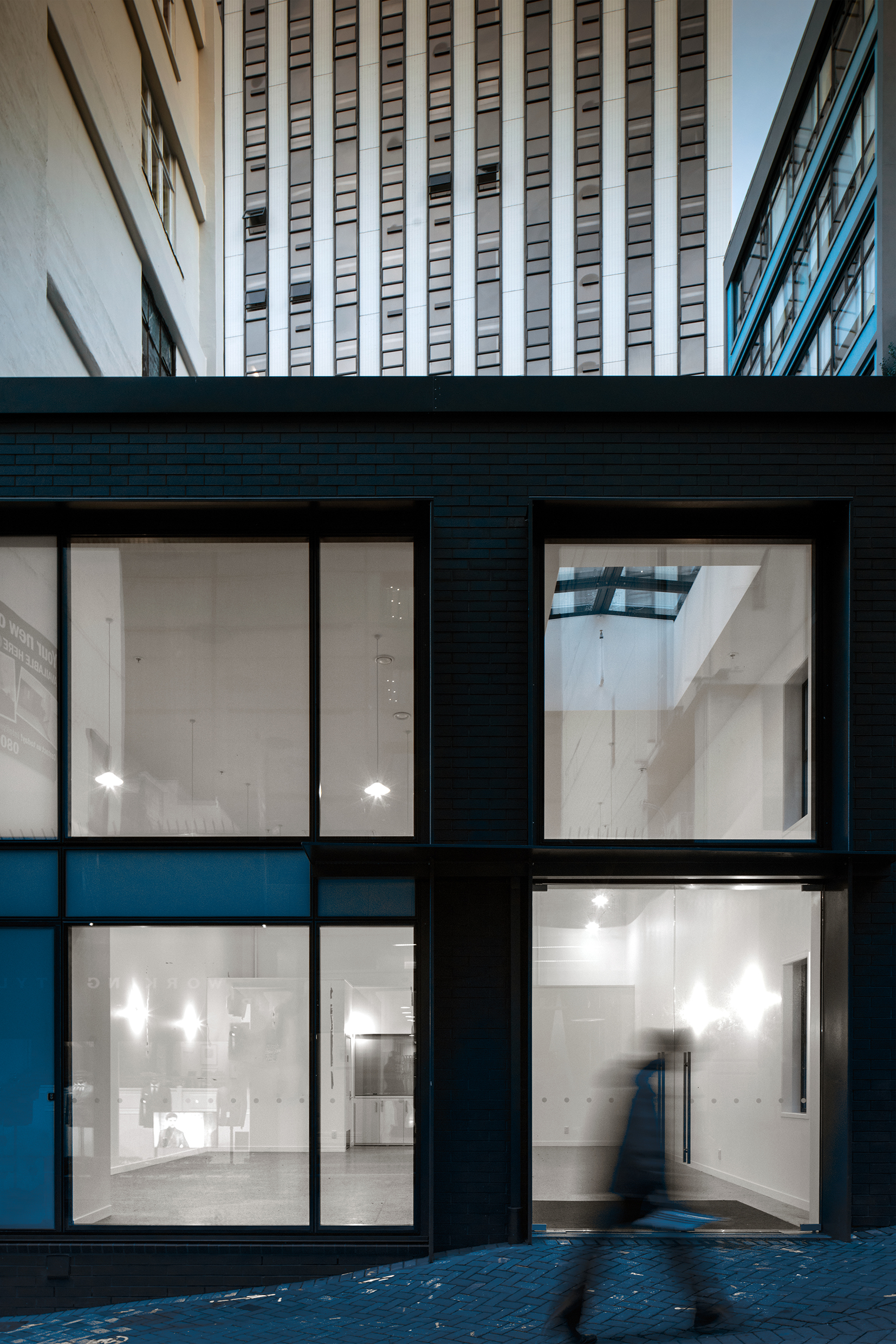
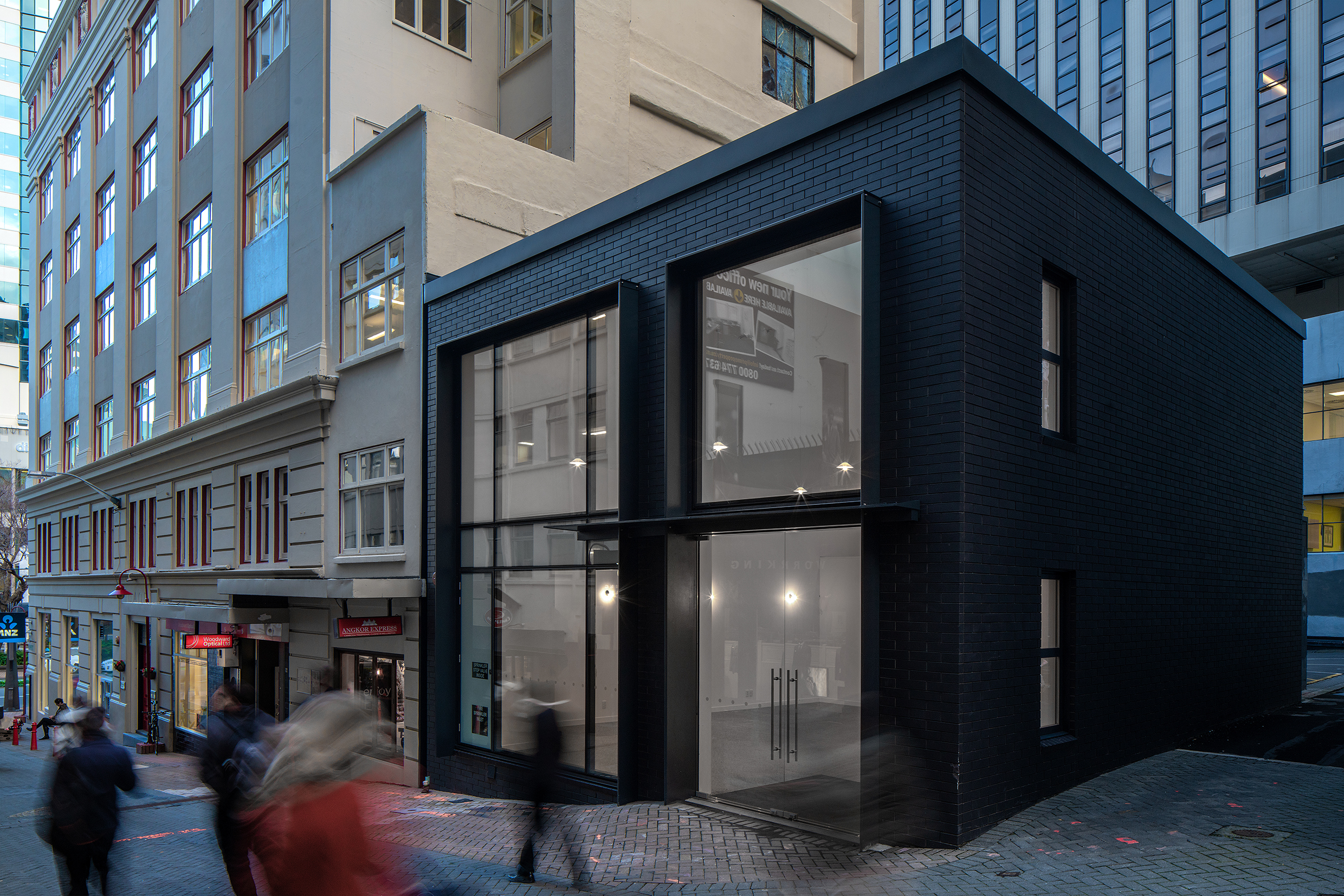
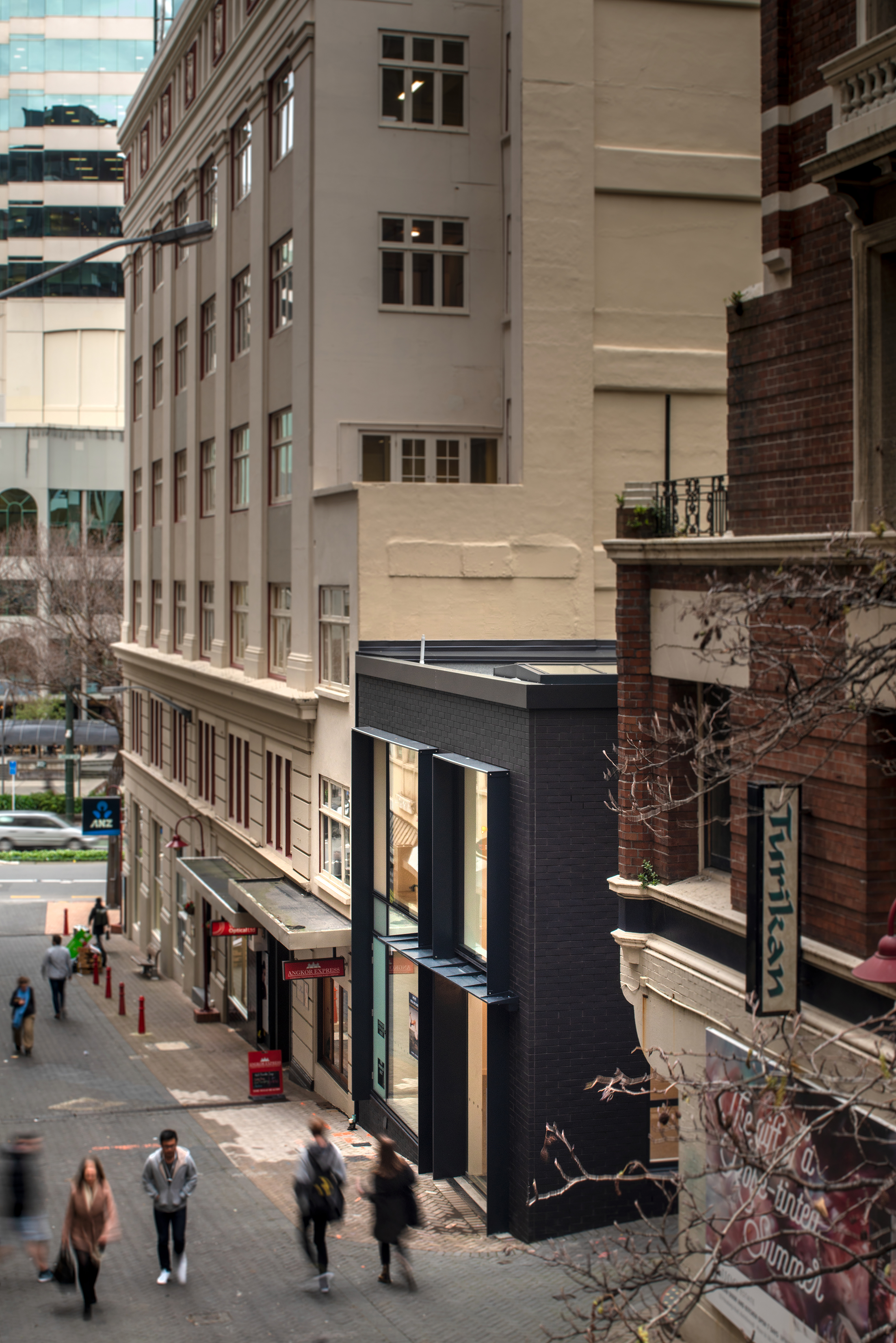
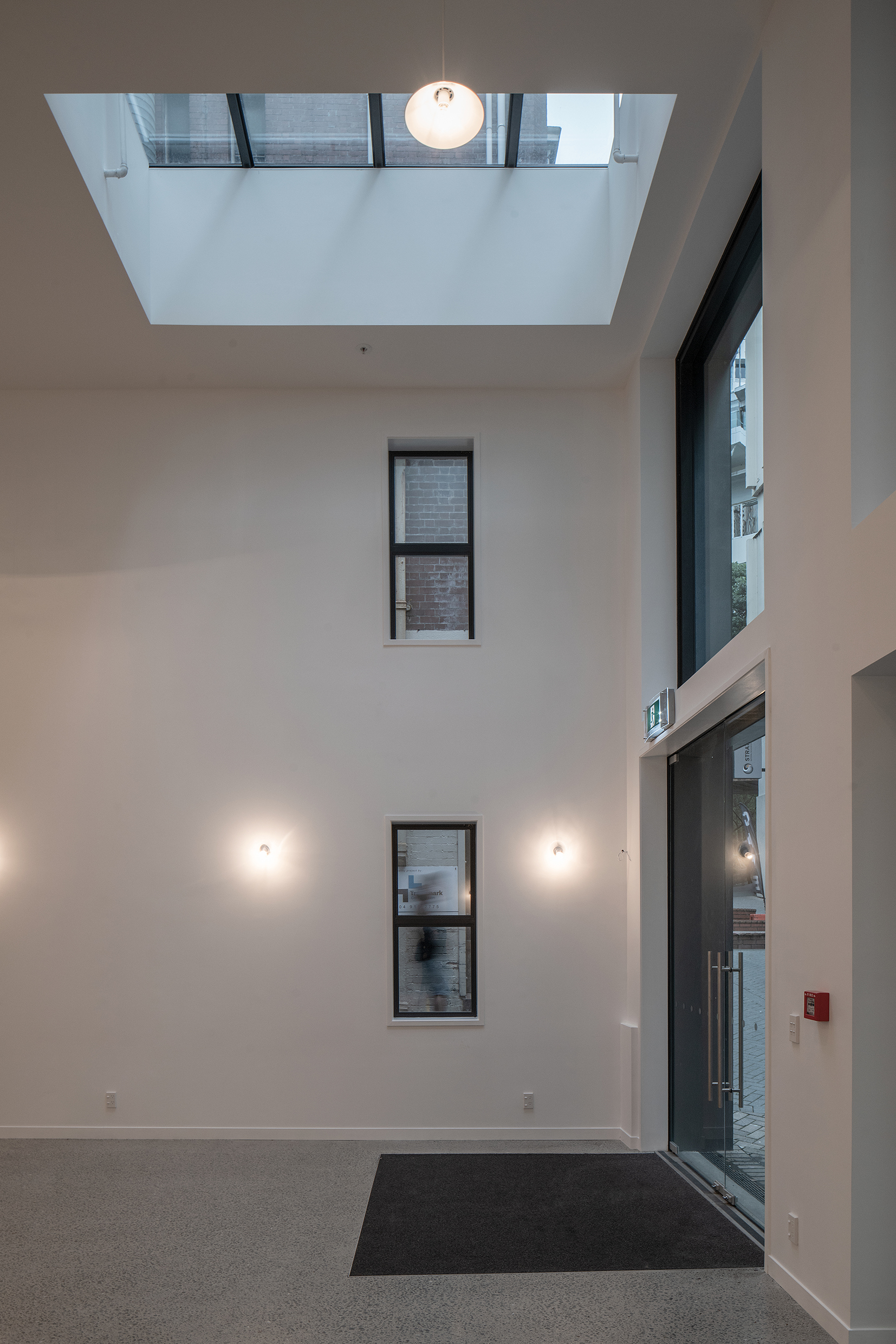
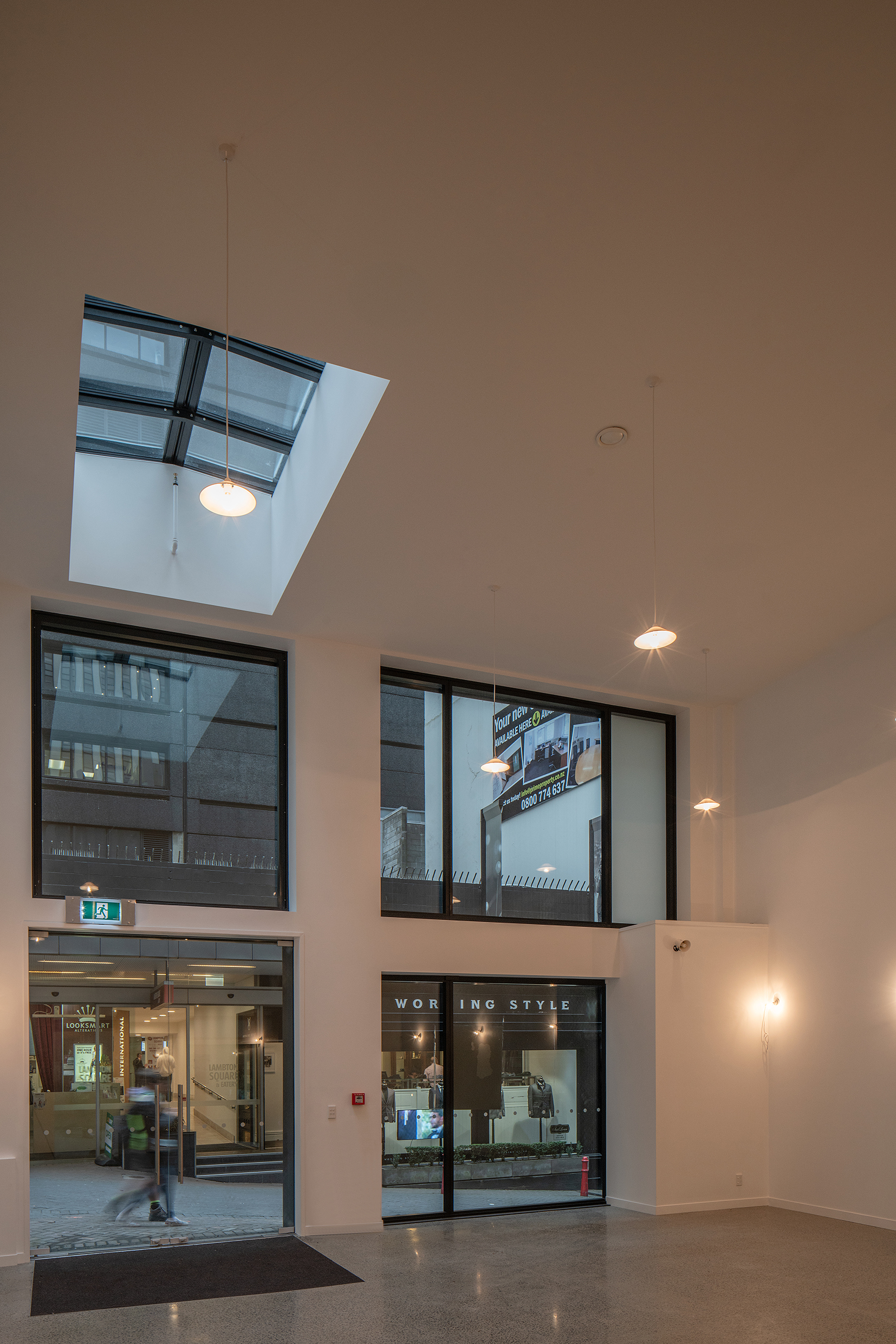
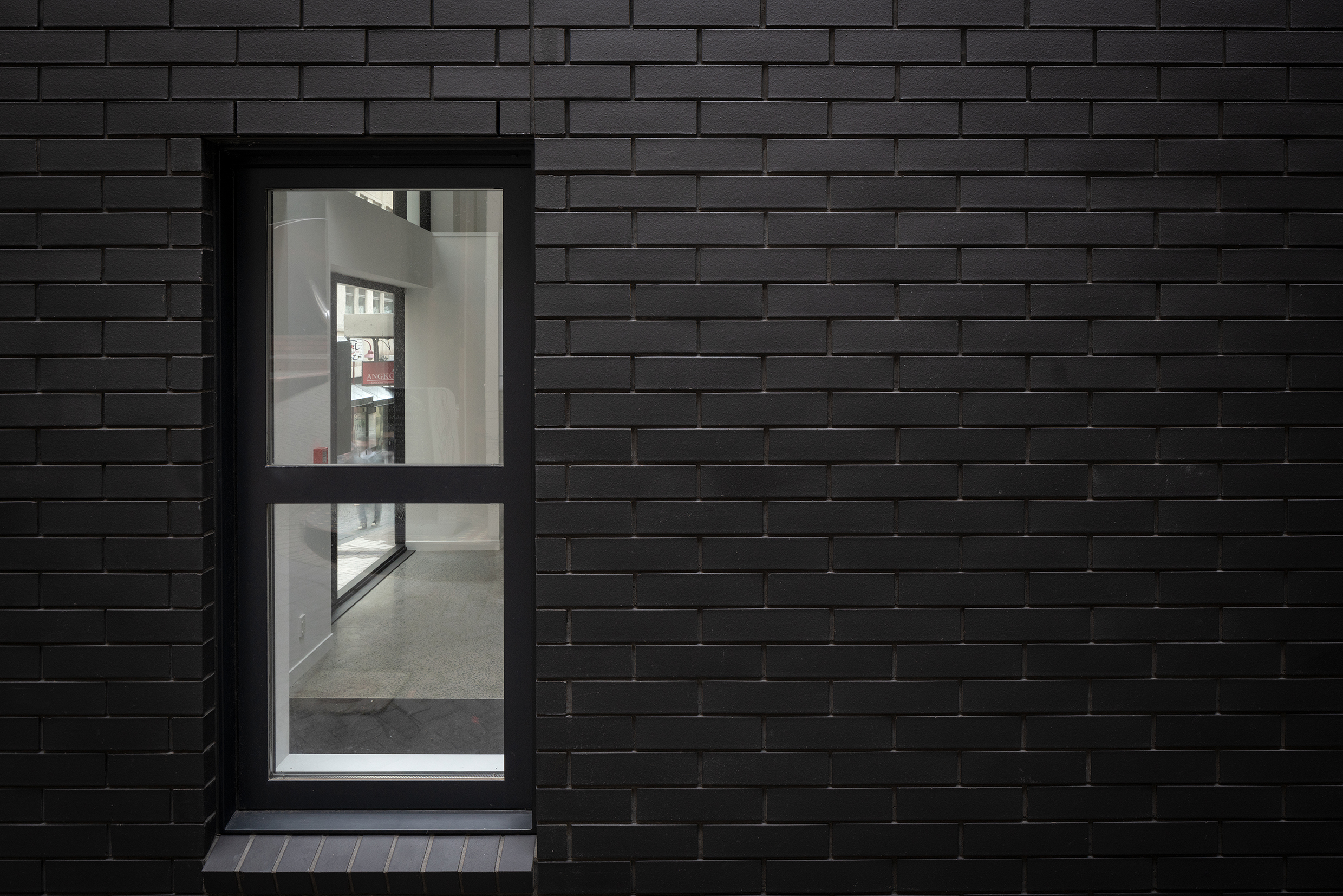
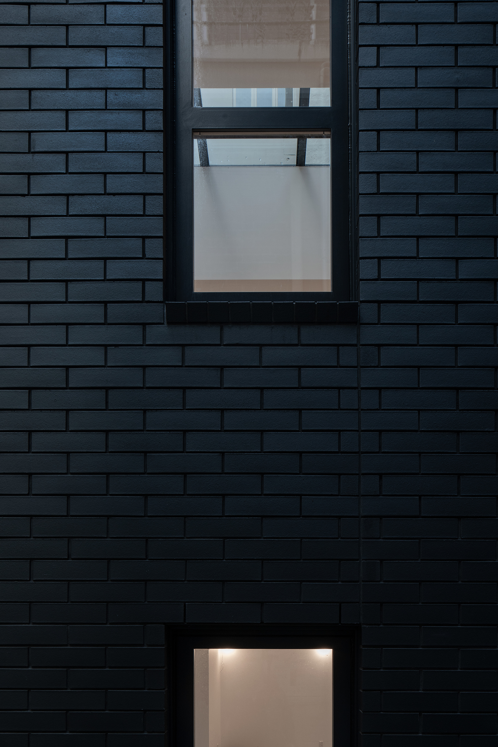
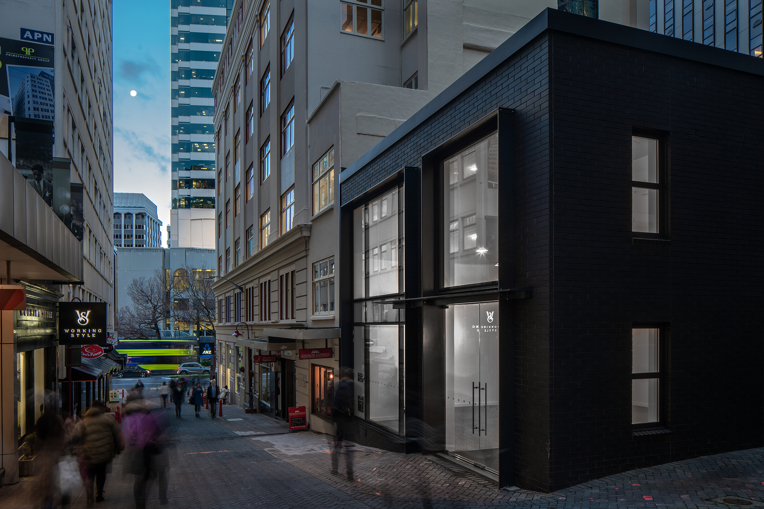
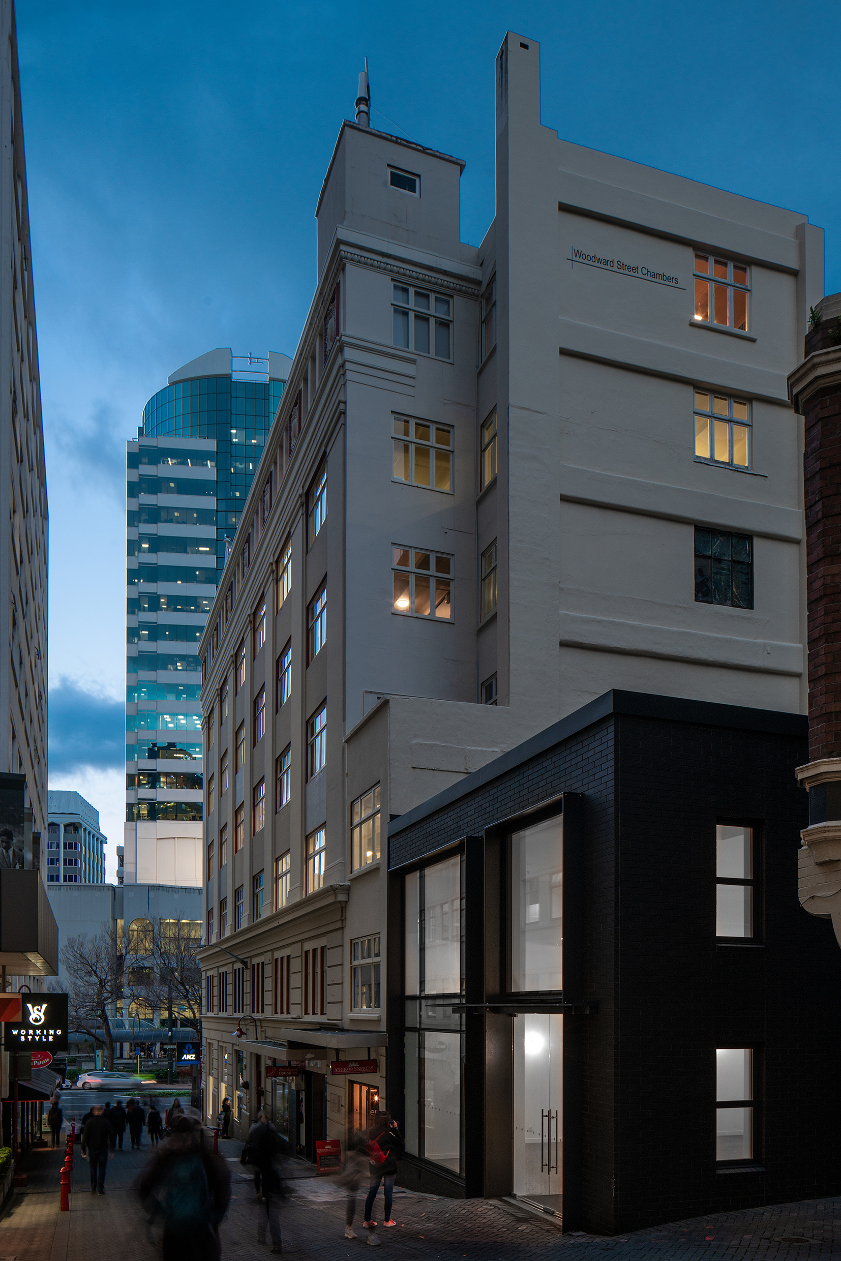
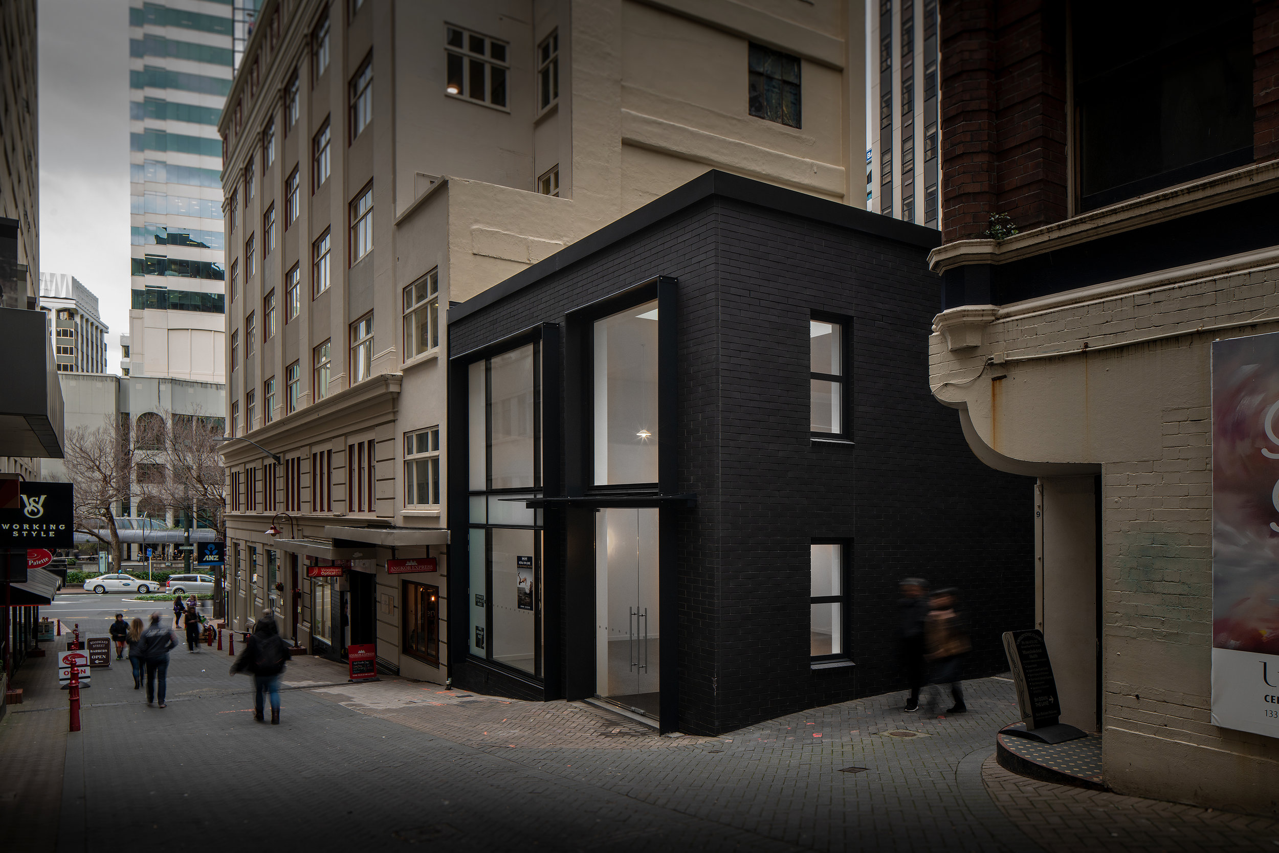
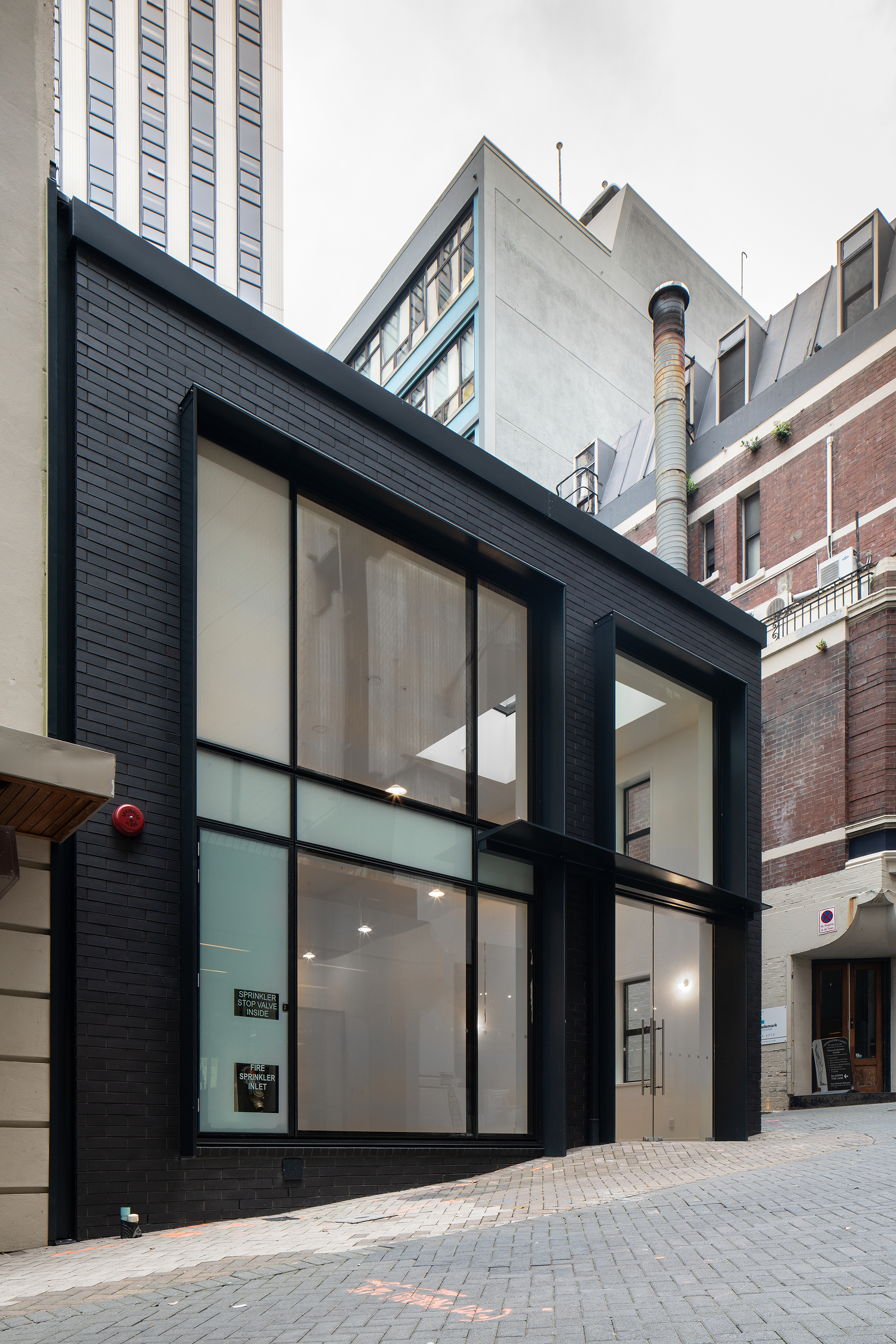
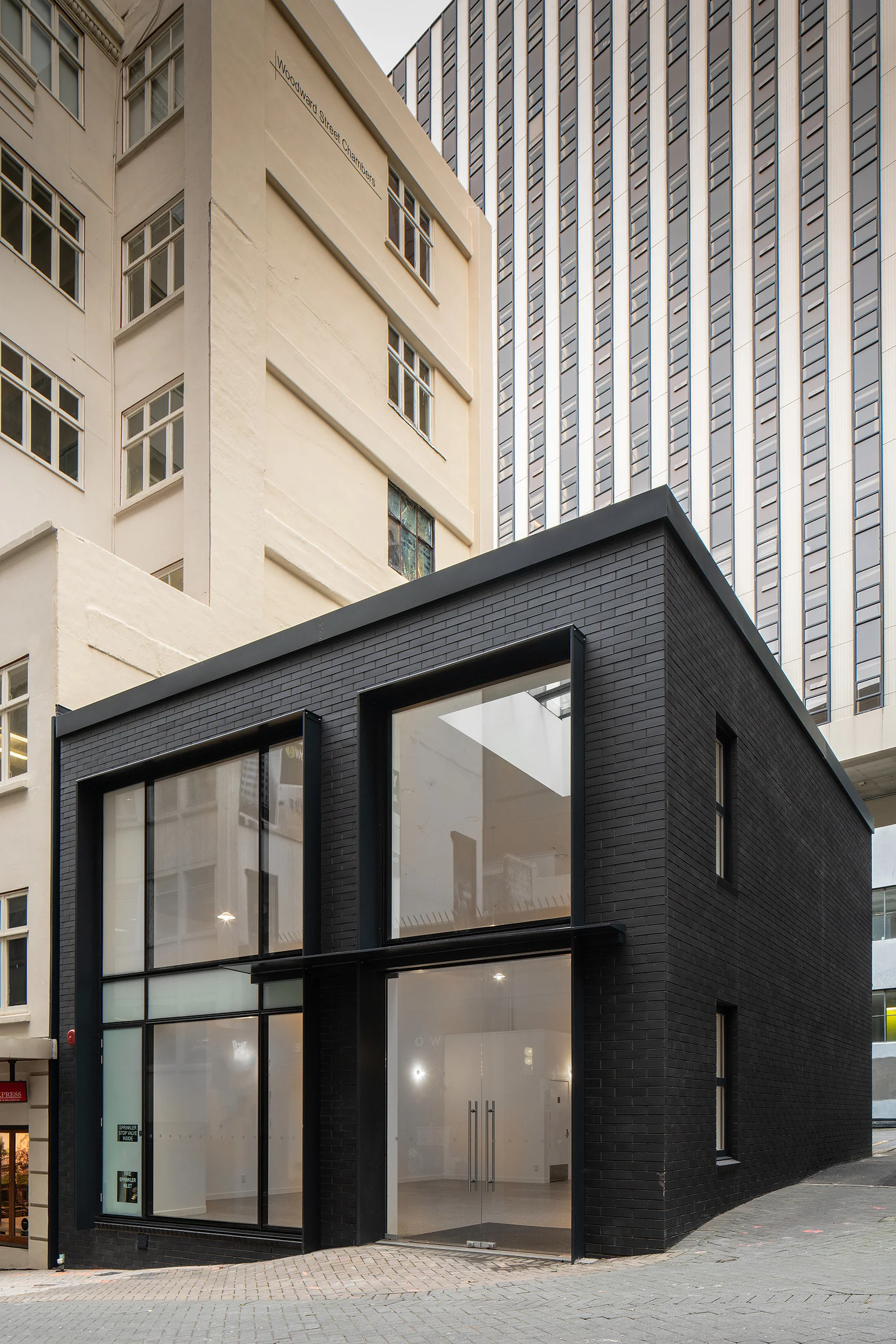
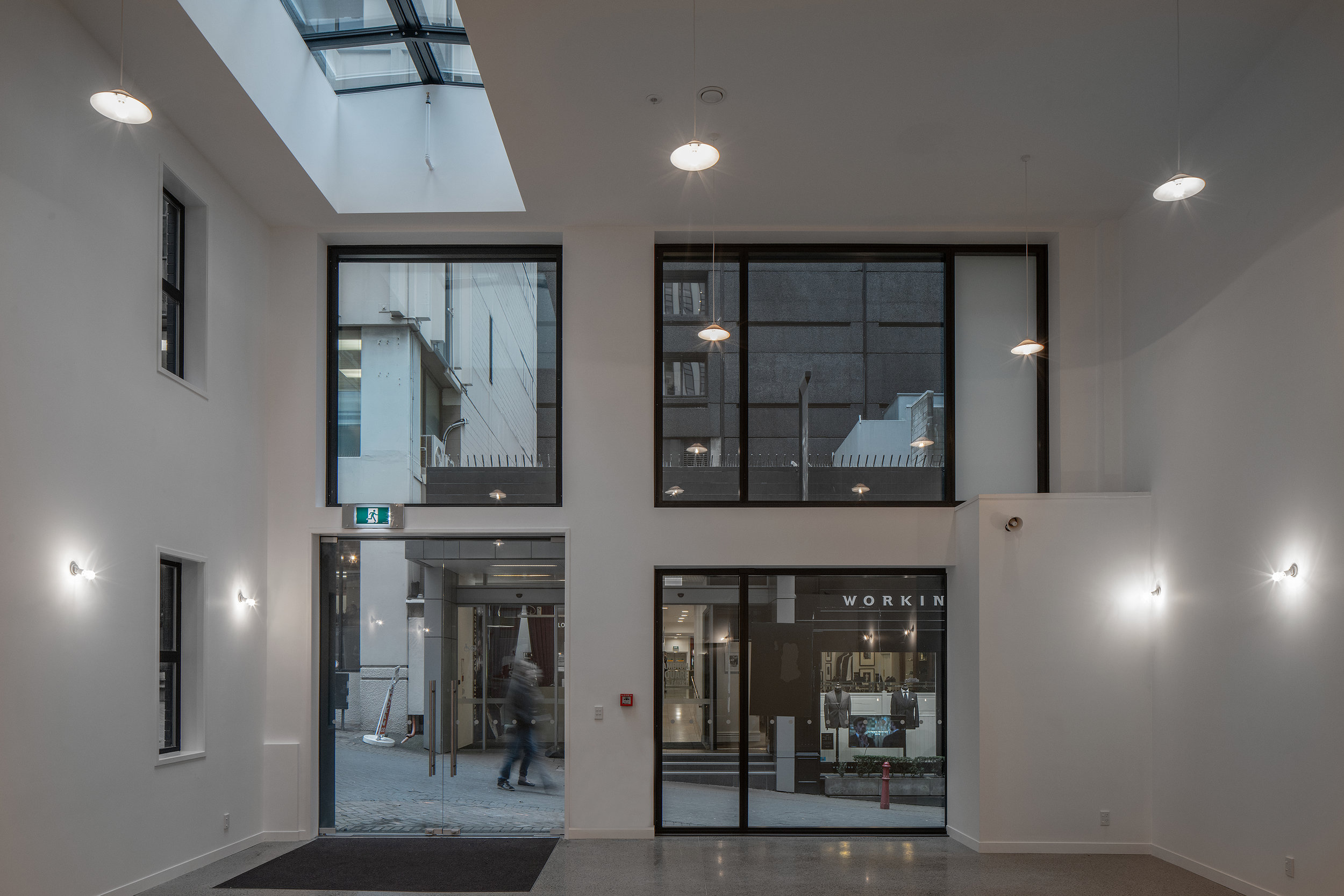
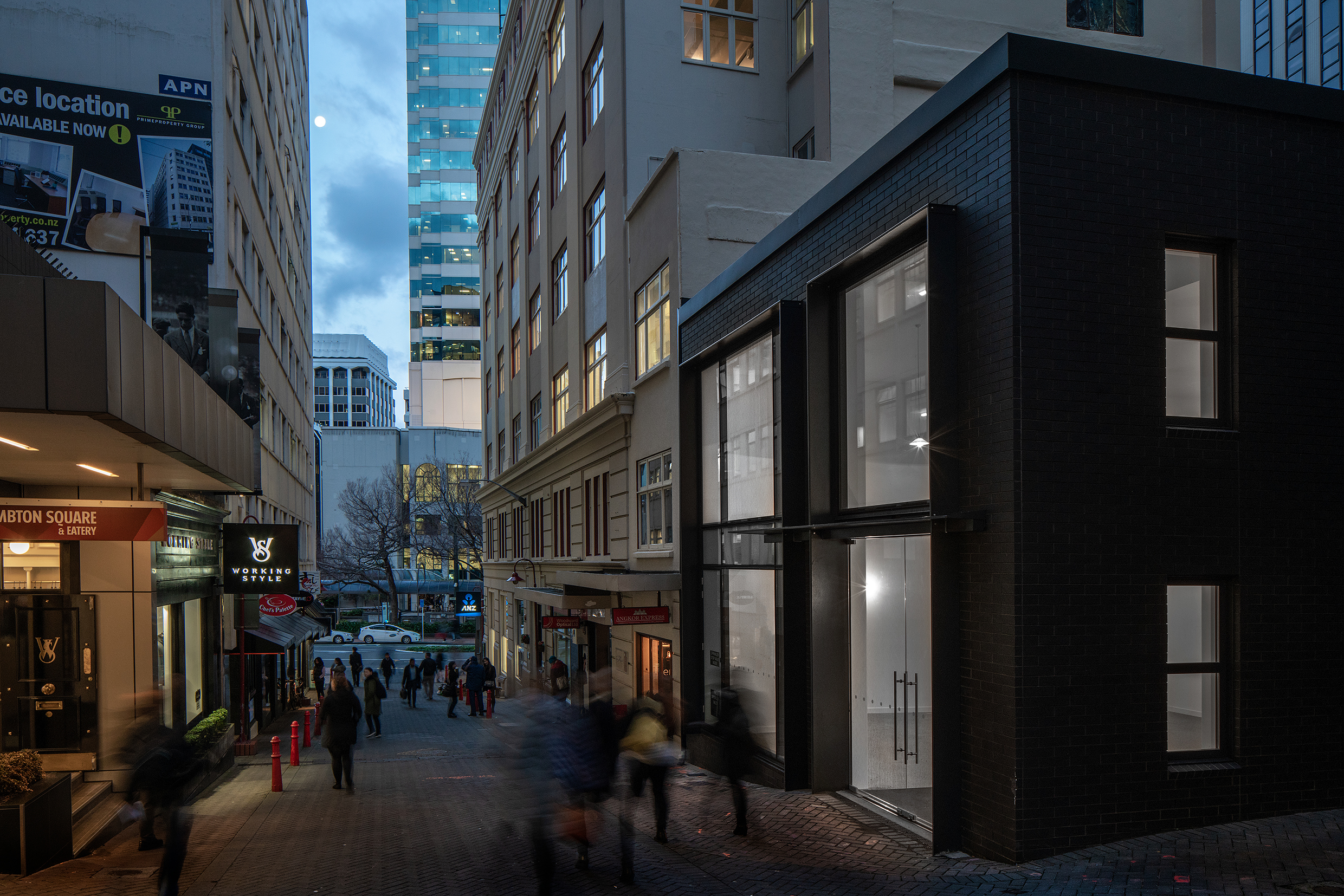
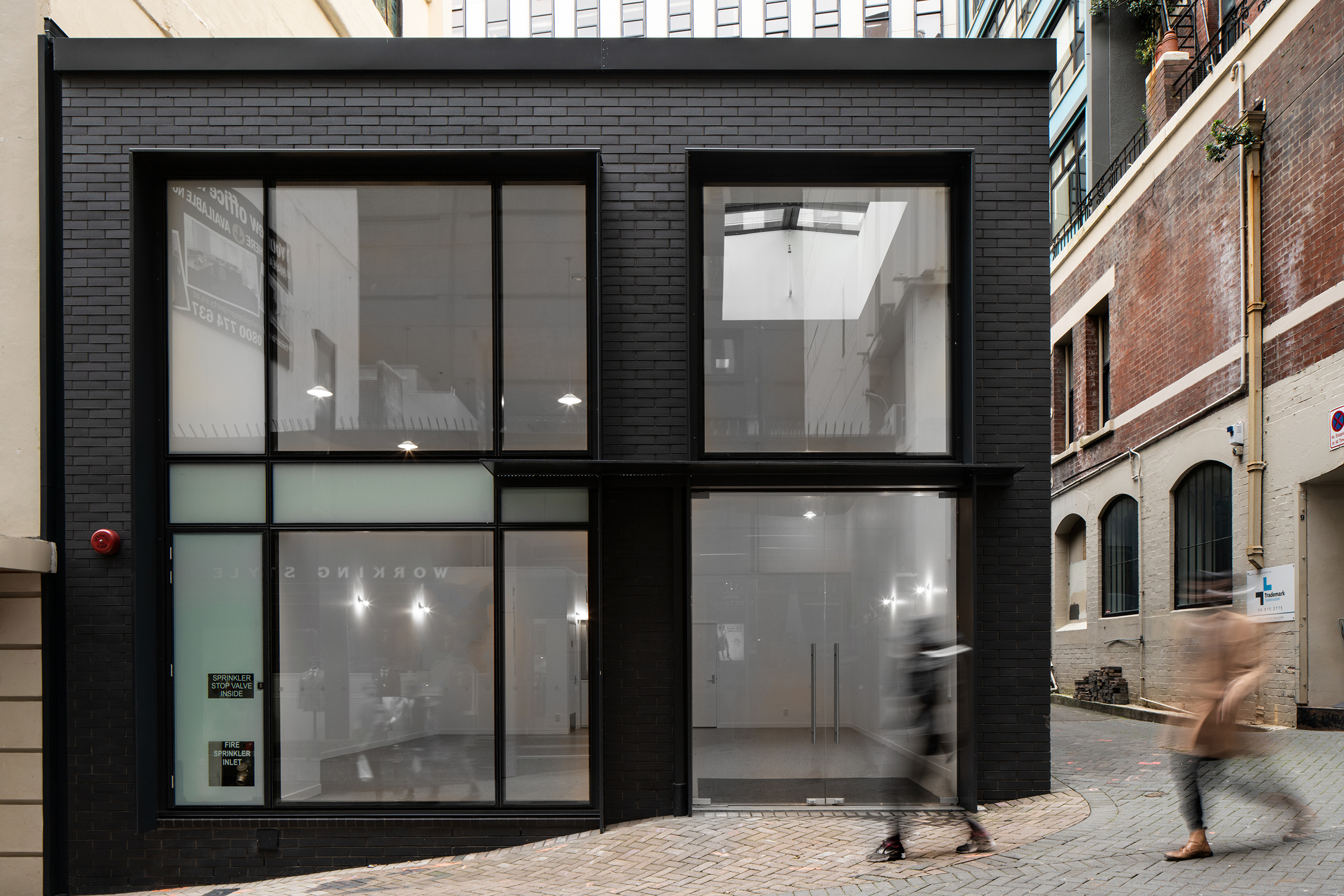
Woodward Street was a project involving the restrengthening, internal and exterior configuration of an existing mixed-use premise.
We proposed new exterior building work that will utilize materials/finishes matching those currently used on the existing building, and consider the work minor in nature and sympathetic to the existing building fabric.
A replacement of the shopfront, removal of the front entry alcove, provision of an entry canopy, reconfiguration of the lane way access directed the ground level design work. On the upper levels, the Western facade window configuration was re-designed and reconfiguration of the building's rear stairs altered the current roof access, although not visible from the street.
The end result was a striking, contemporary addition to the Wellington urban streetscape and has been beautifully photographed by Andy Spain.













multi-level car park - wellington airport
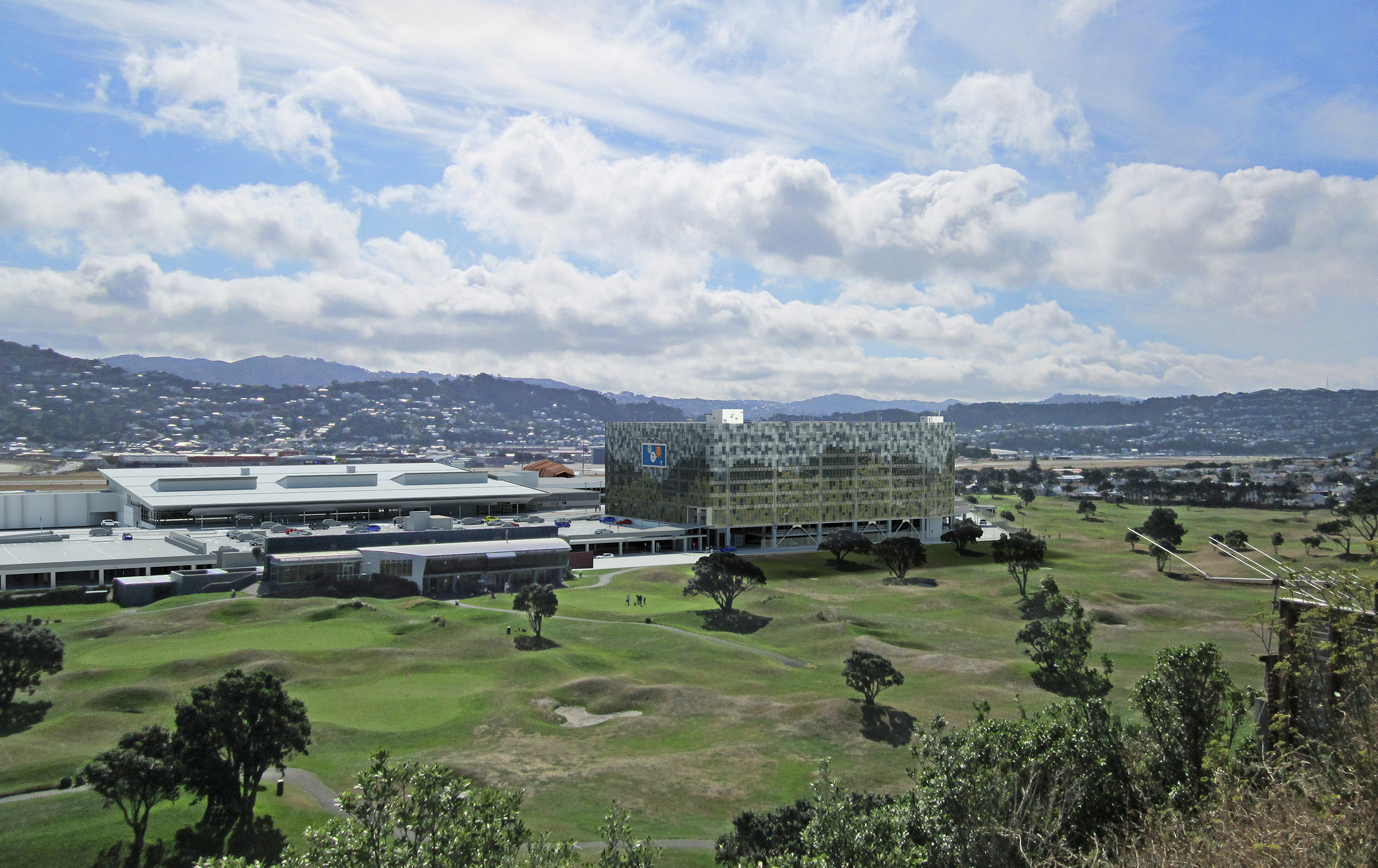
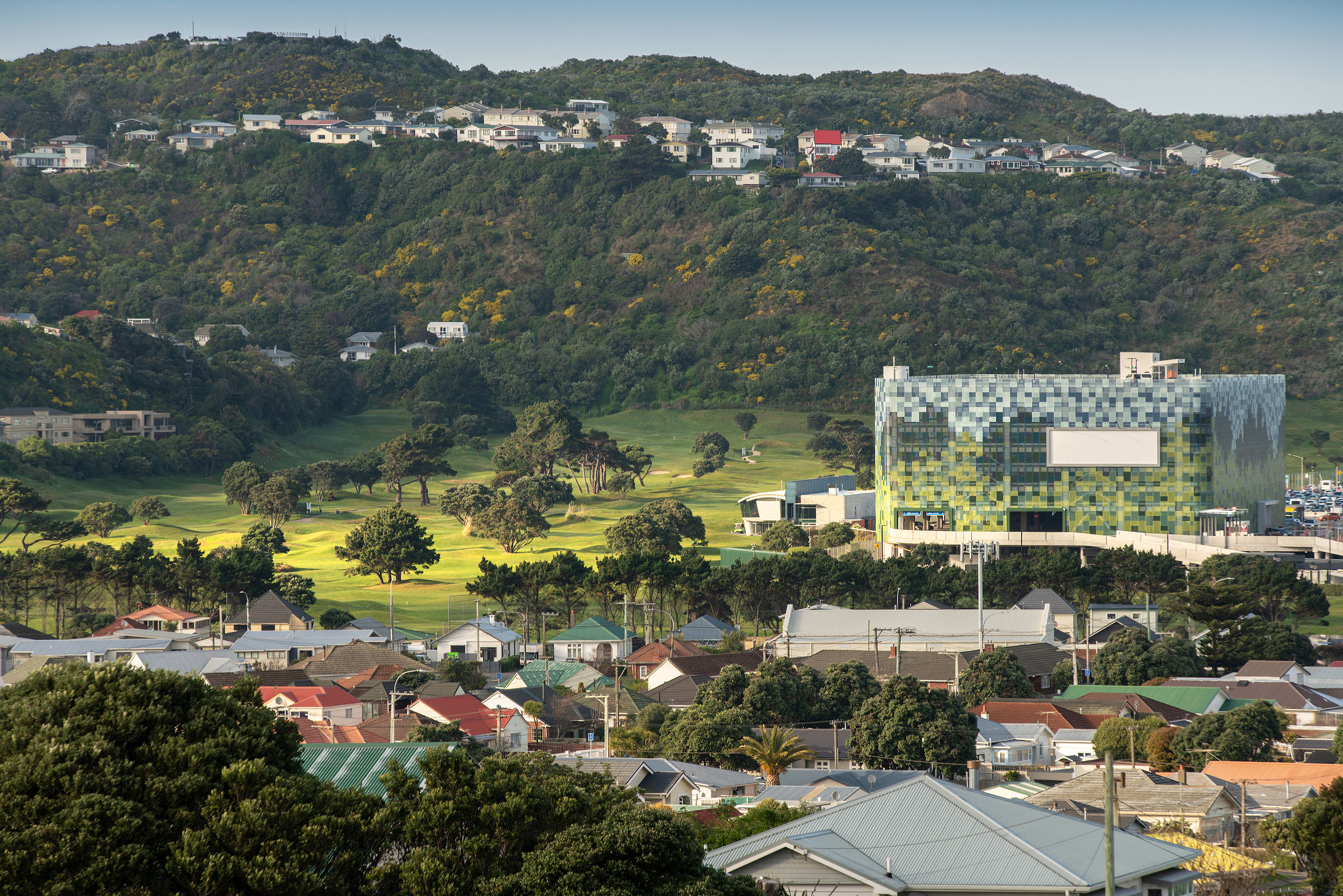
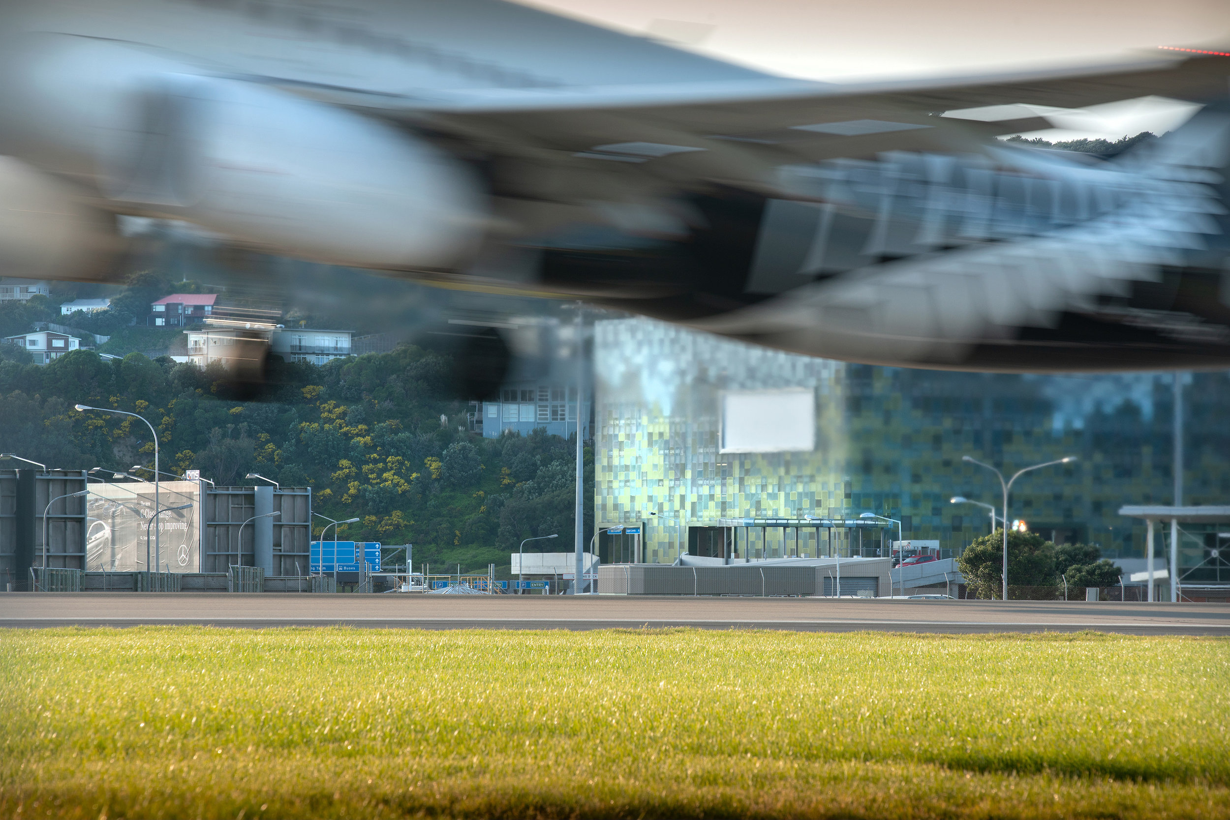
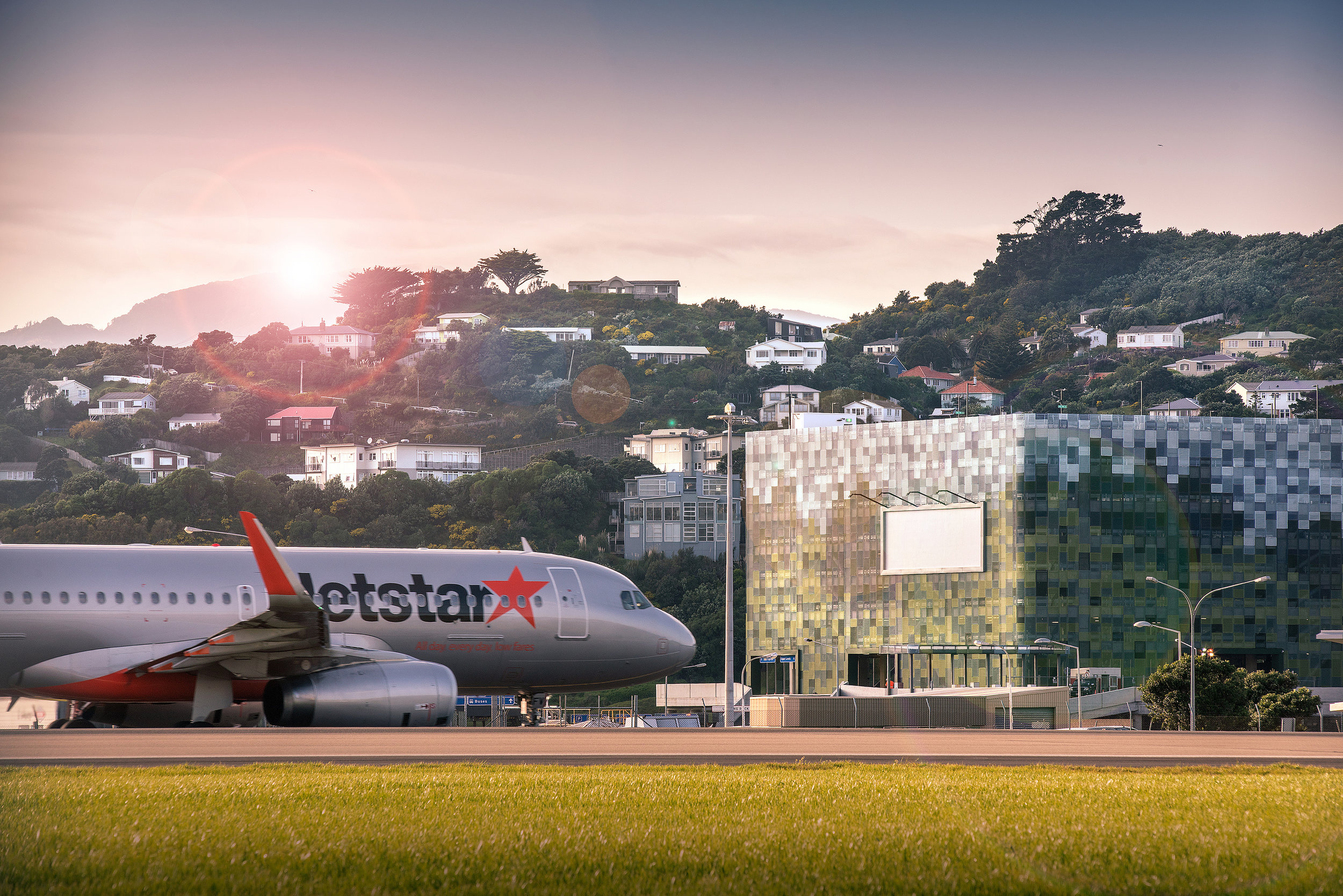
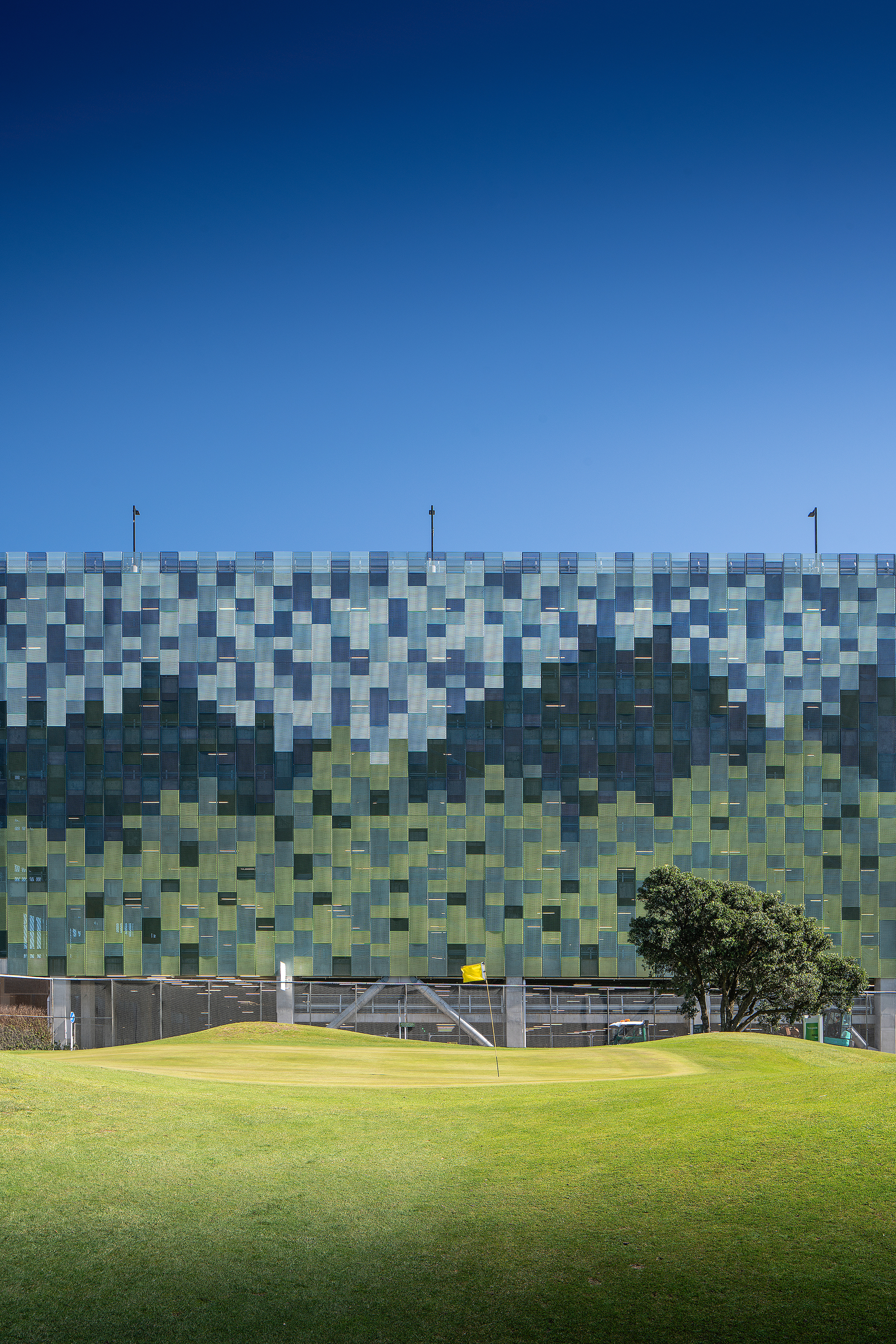
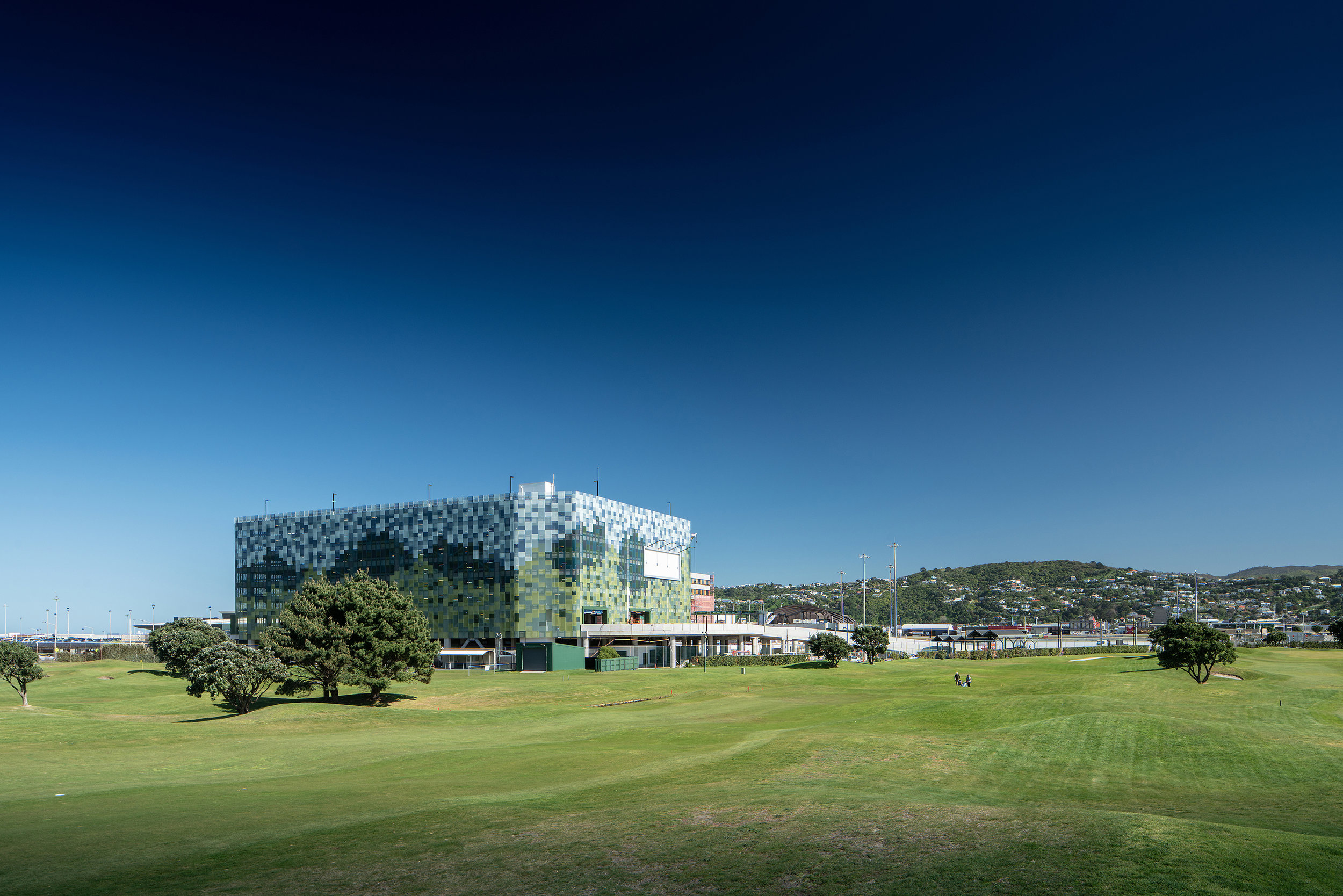
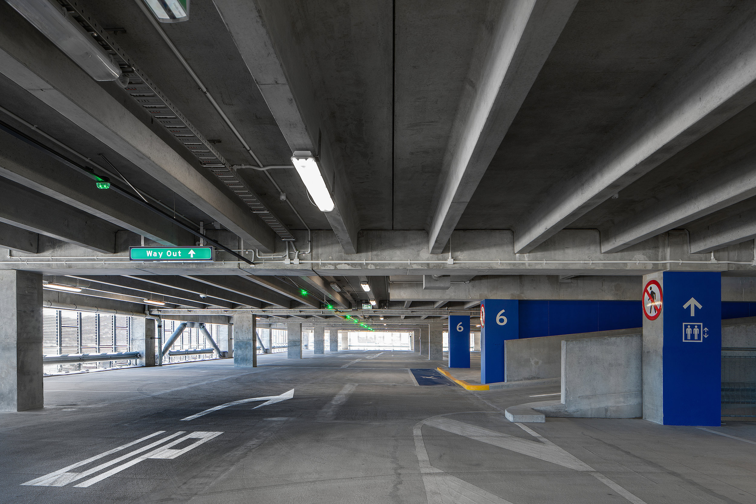
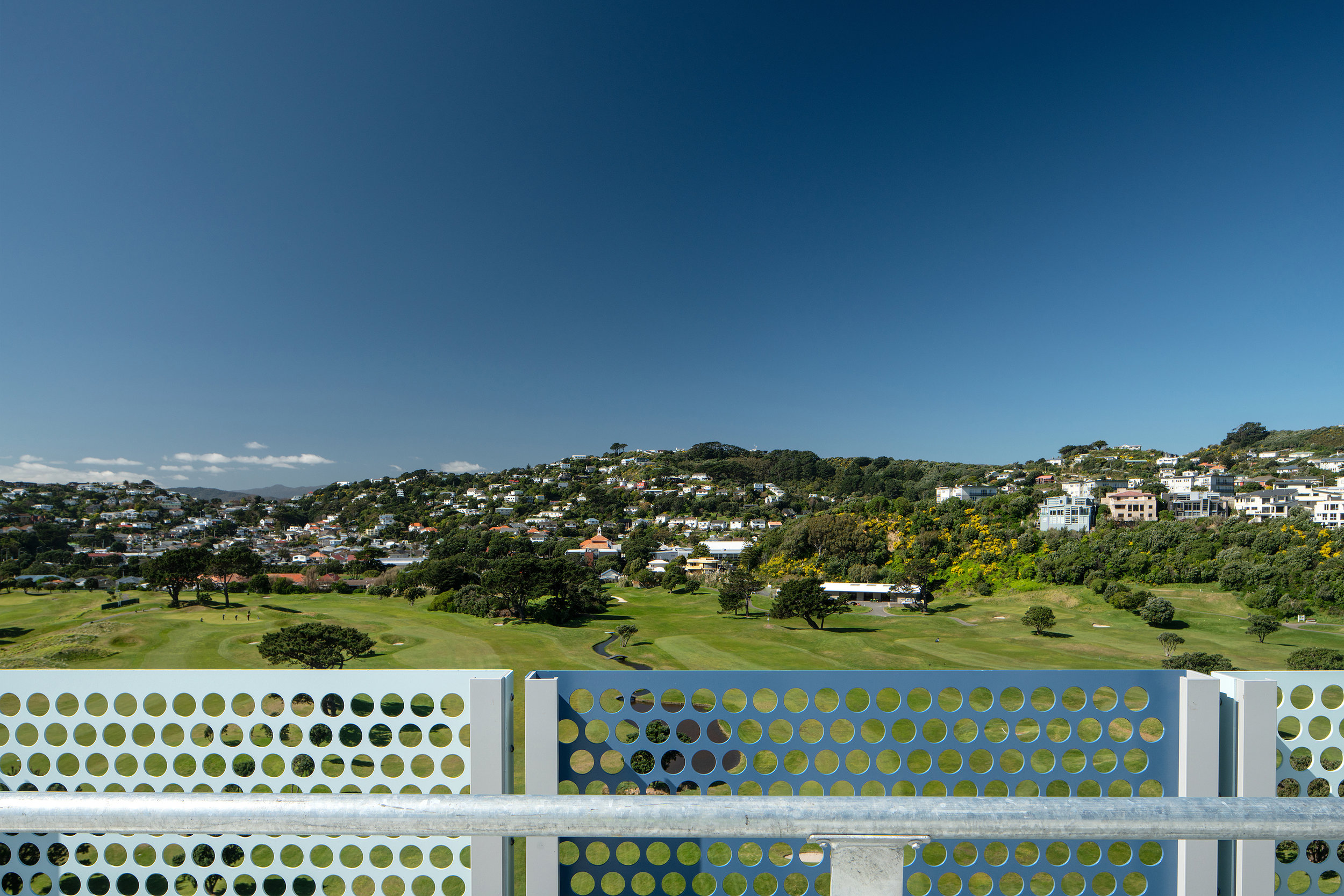
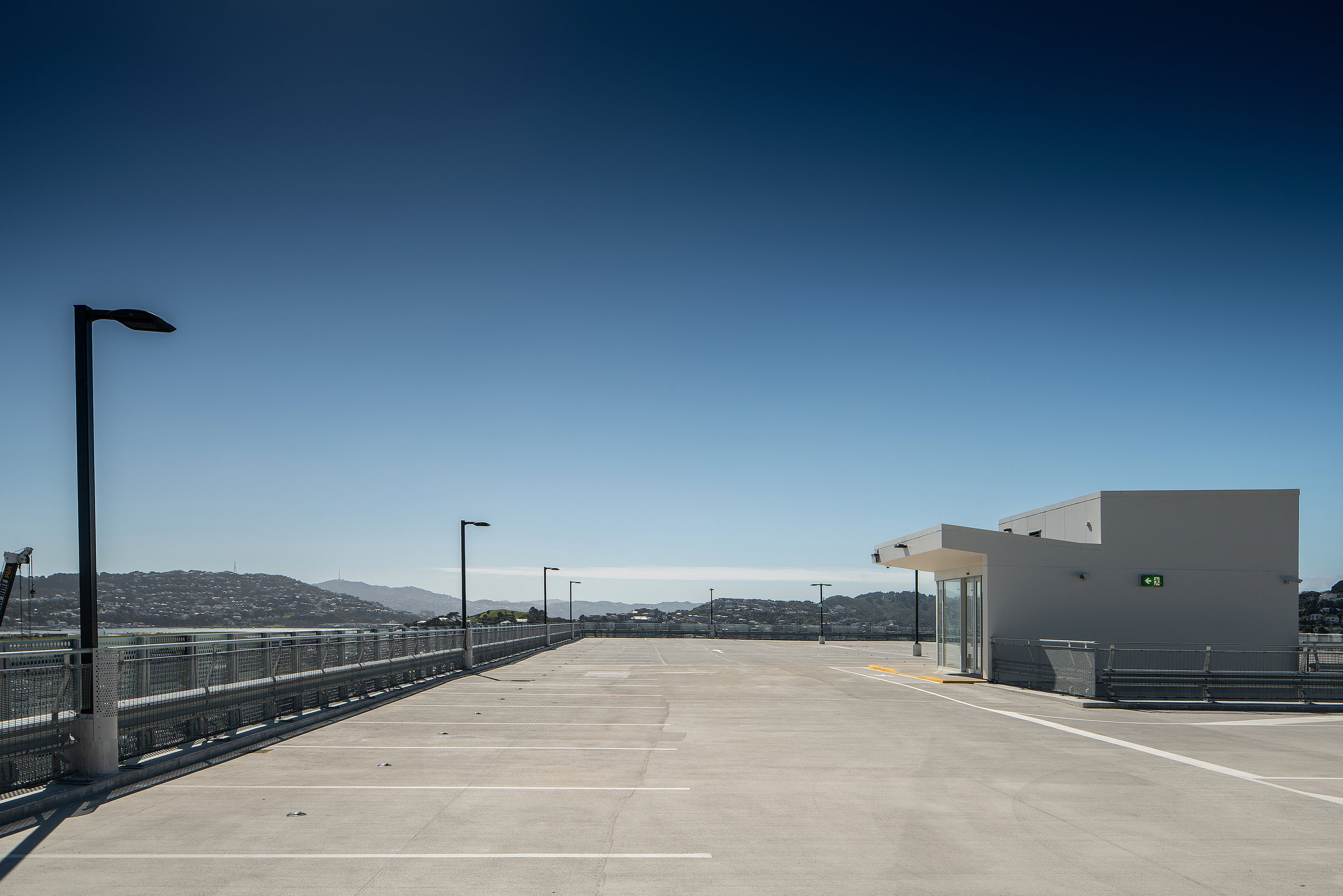
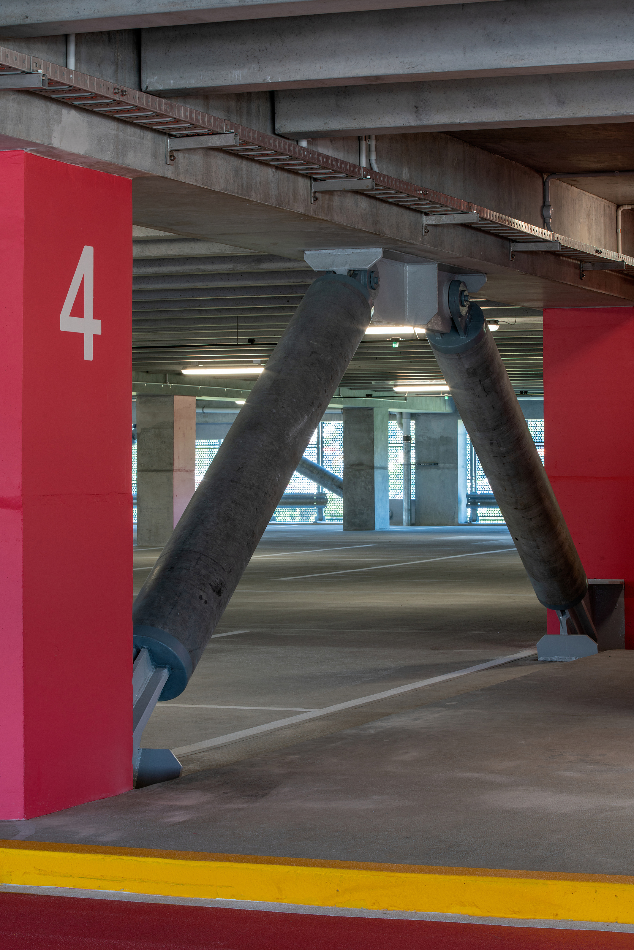
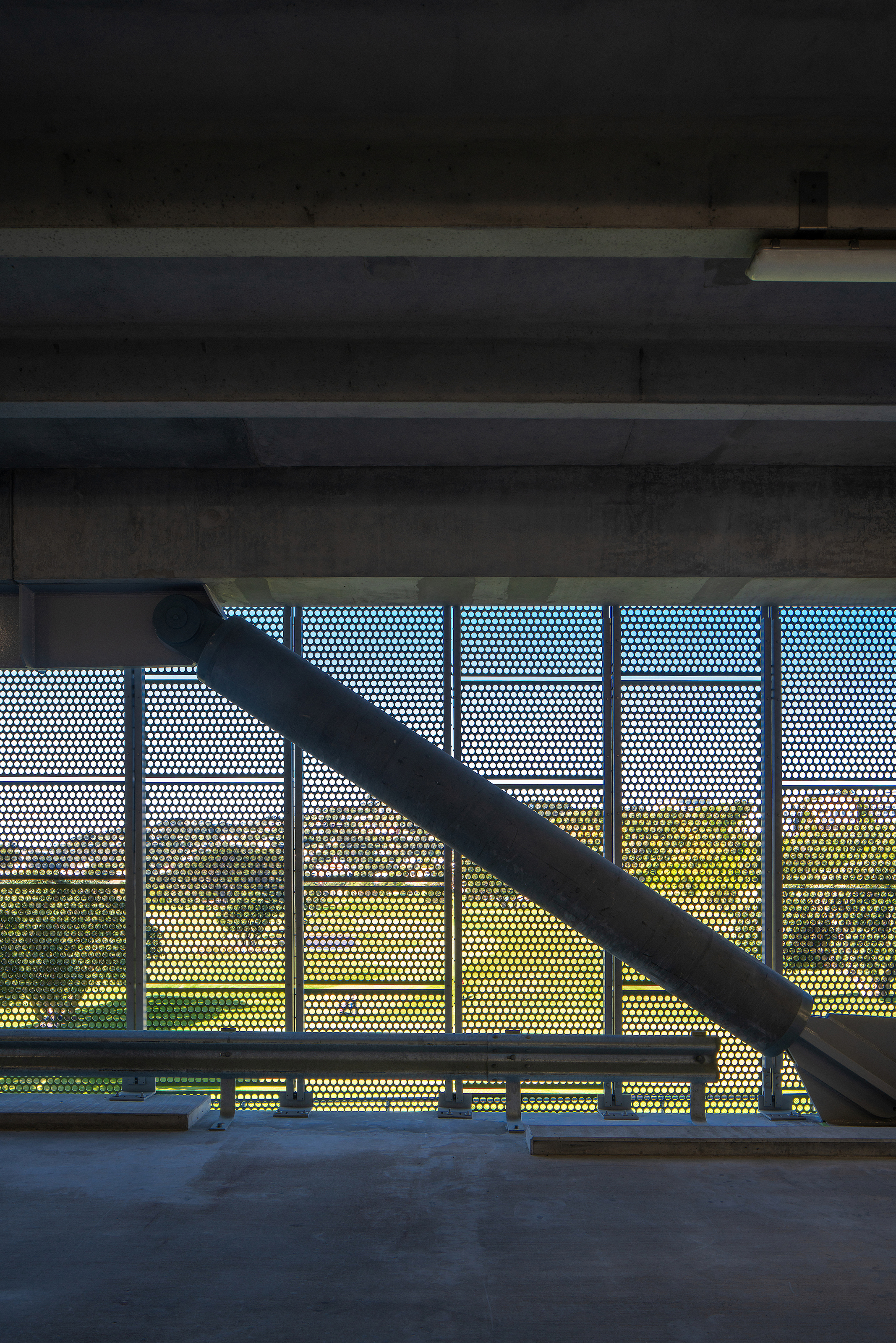
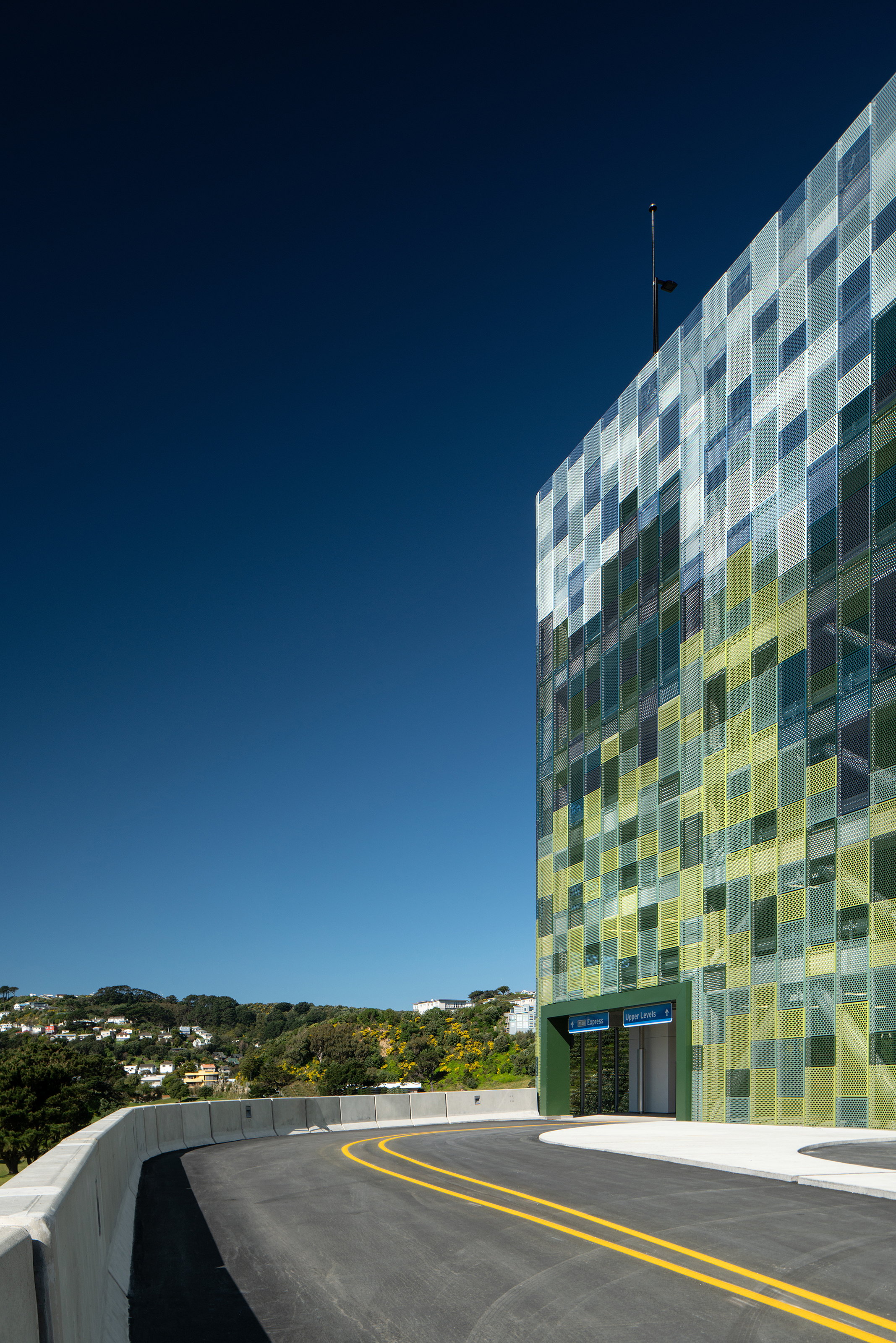
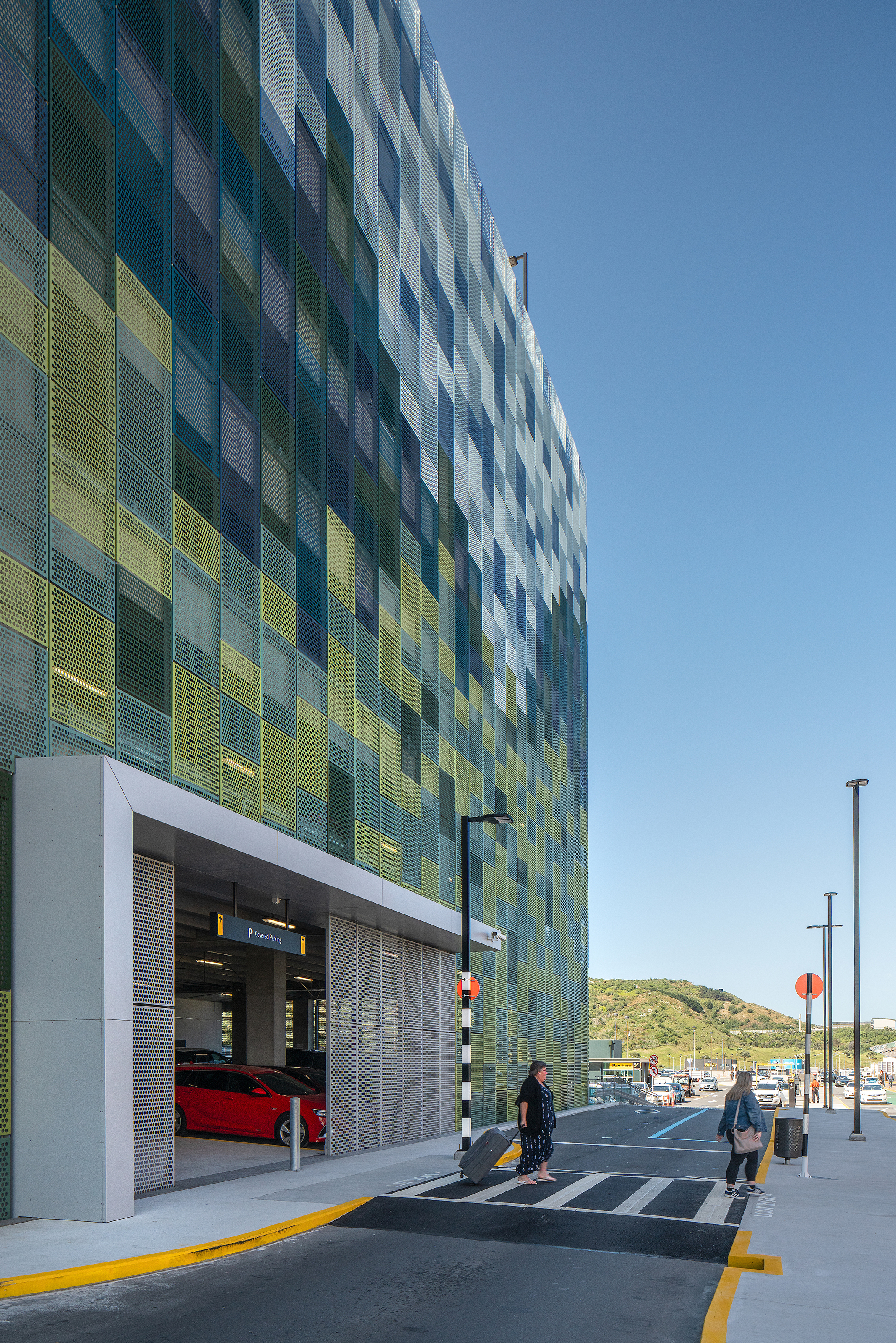
The growing passenger and flight numbers to Wellington International Airport has increased the demand for car-parking. The new 10 level car-parking building will provide 1,090 new car-parks in close proximity to the terminal building. The car-park building will be equipped with a modern parking guidance system, making it easy for customers to find a free space.
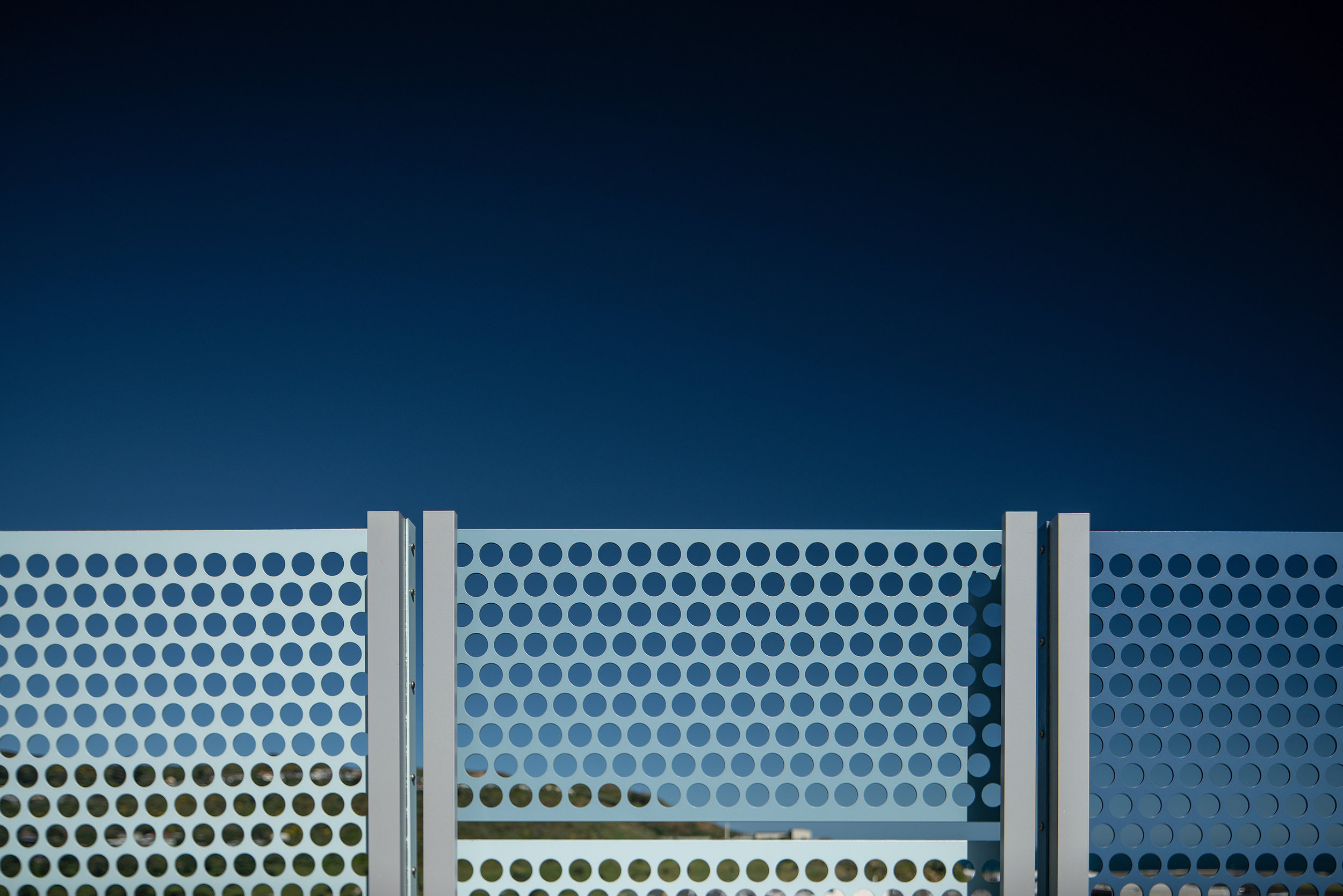
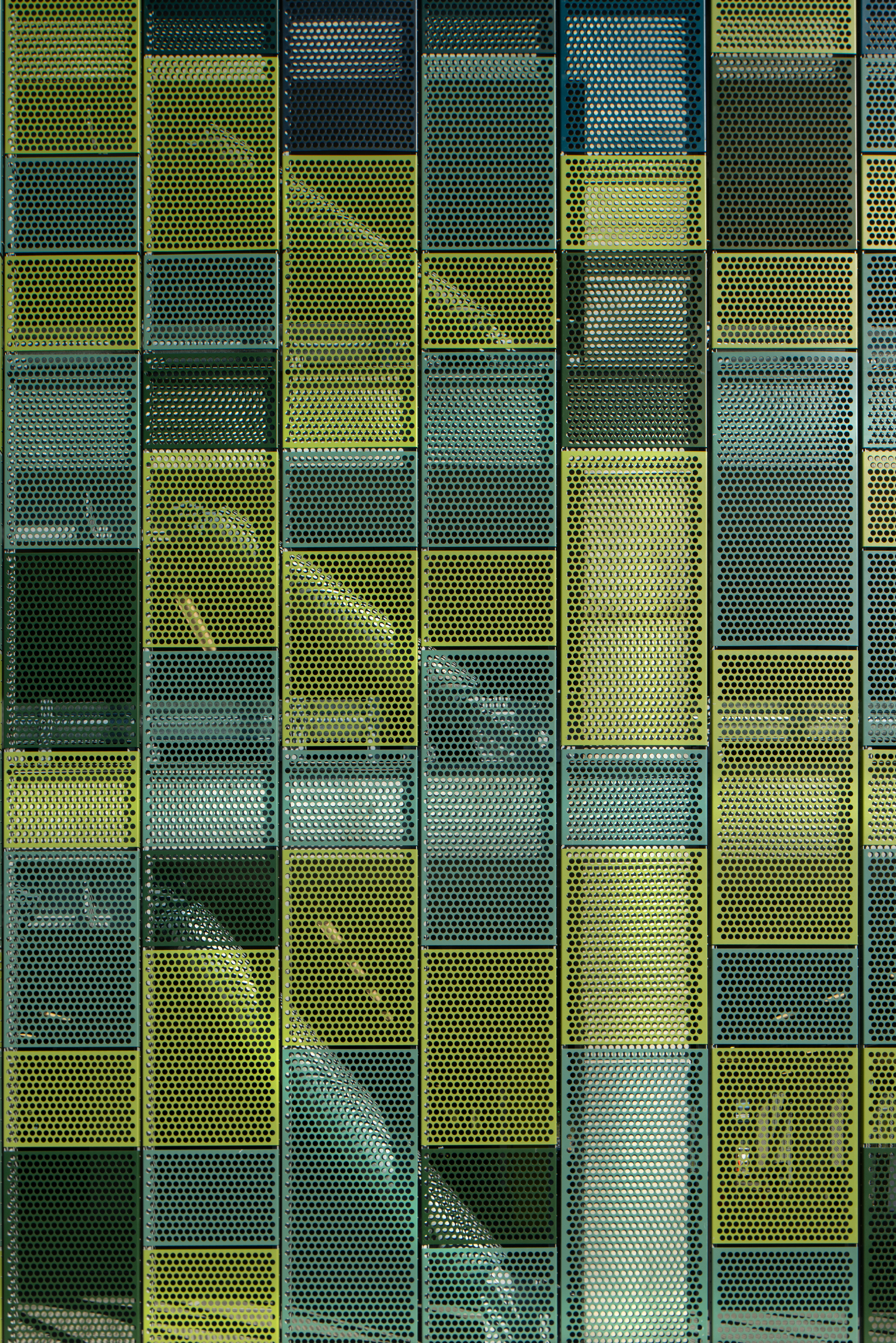
The car-park building is clad in perforated metal panels and the design makes reference to the landscape and colours from the surrounding area by creating a pixelated image of those surroundings in green and blue tones.
On the ground floor, a new transport hub provides facilities for public buses and a covered connection to the terminal. Bike facilities will also be provided in this location.
As part of the project, entry and exit gates to the airport are re-developed and the drop-off area for the airport hotel will also be incorporated into the new traffic layout.
kate sylvester - wellington
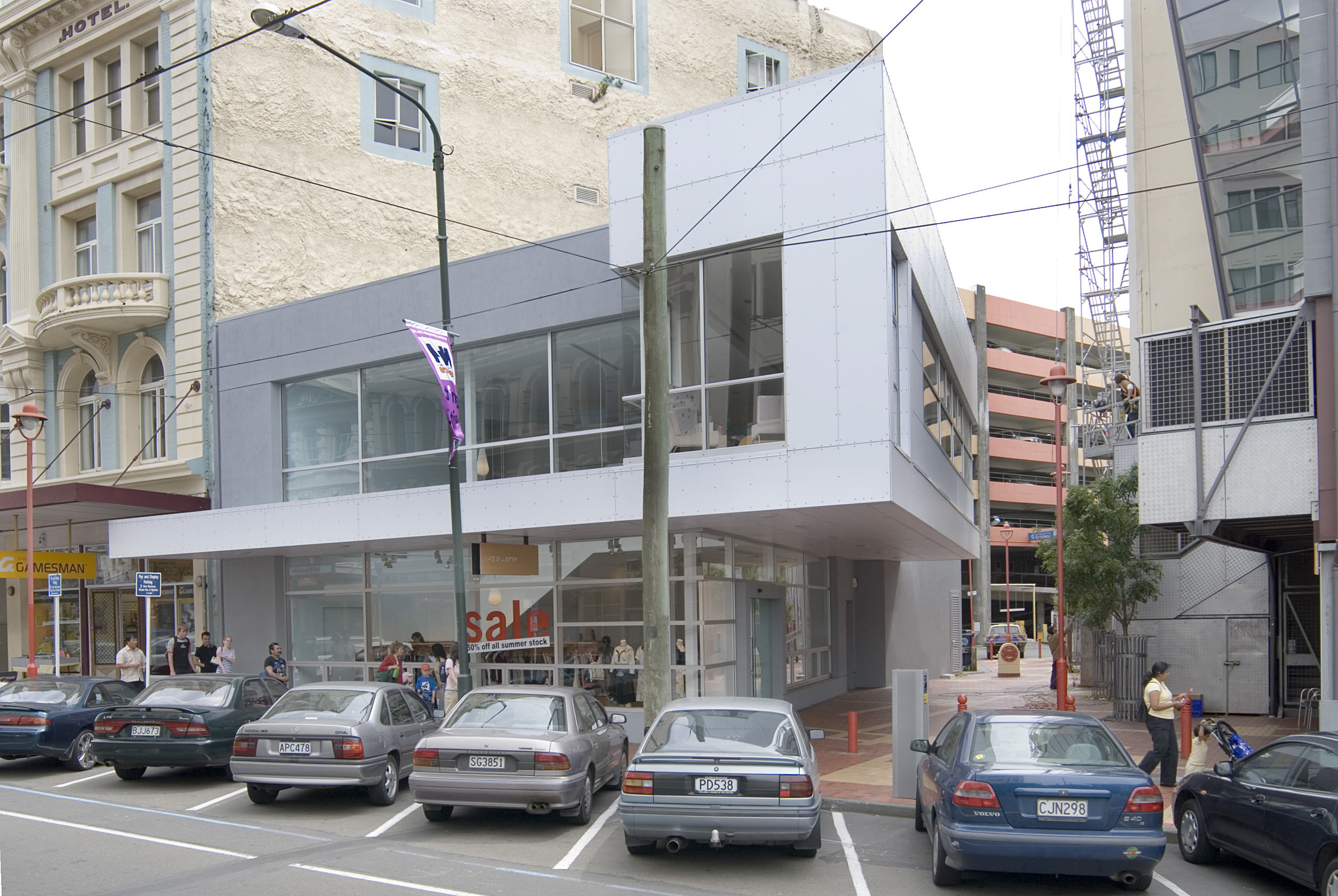
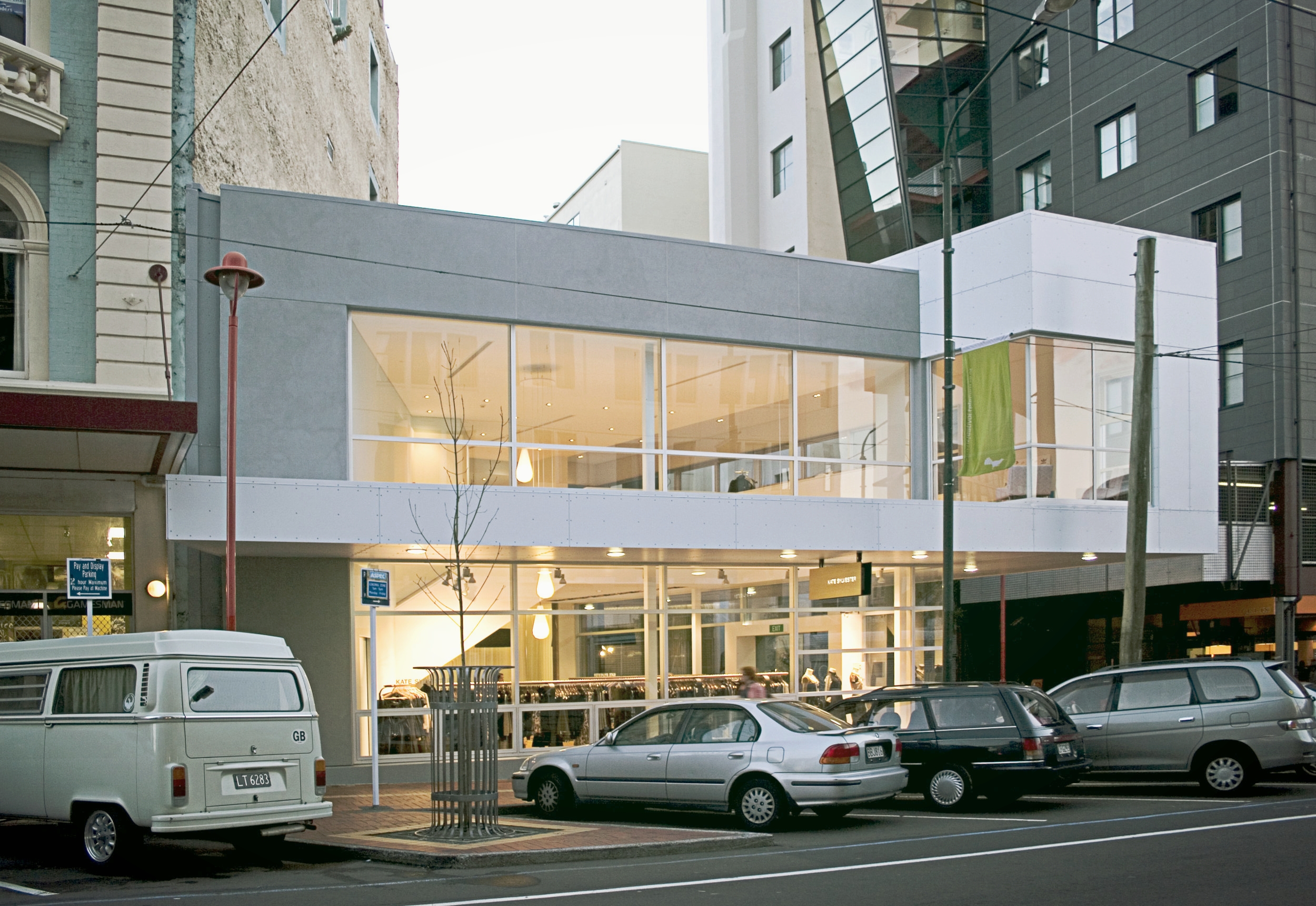
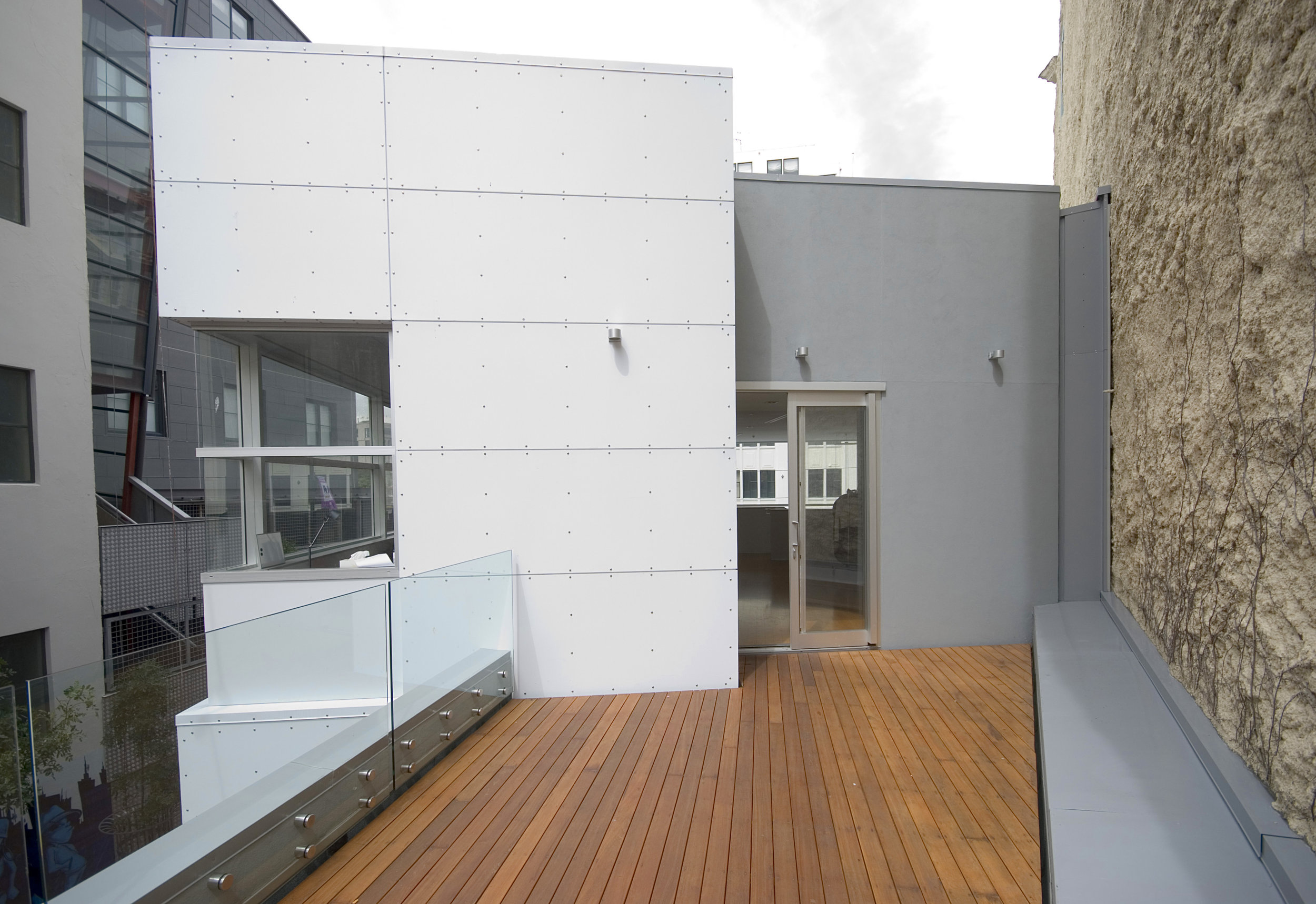
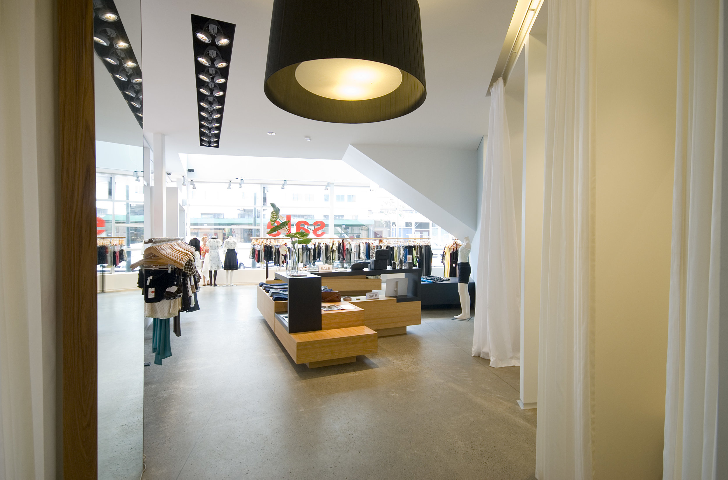
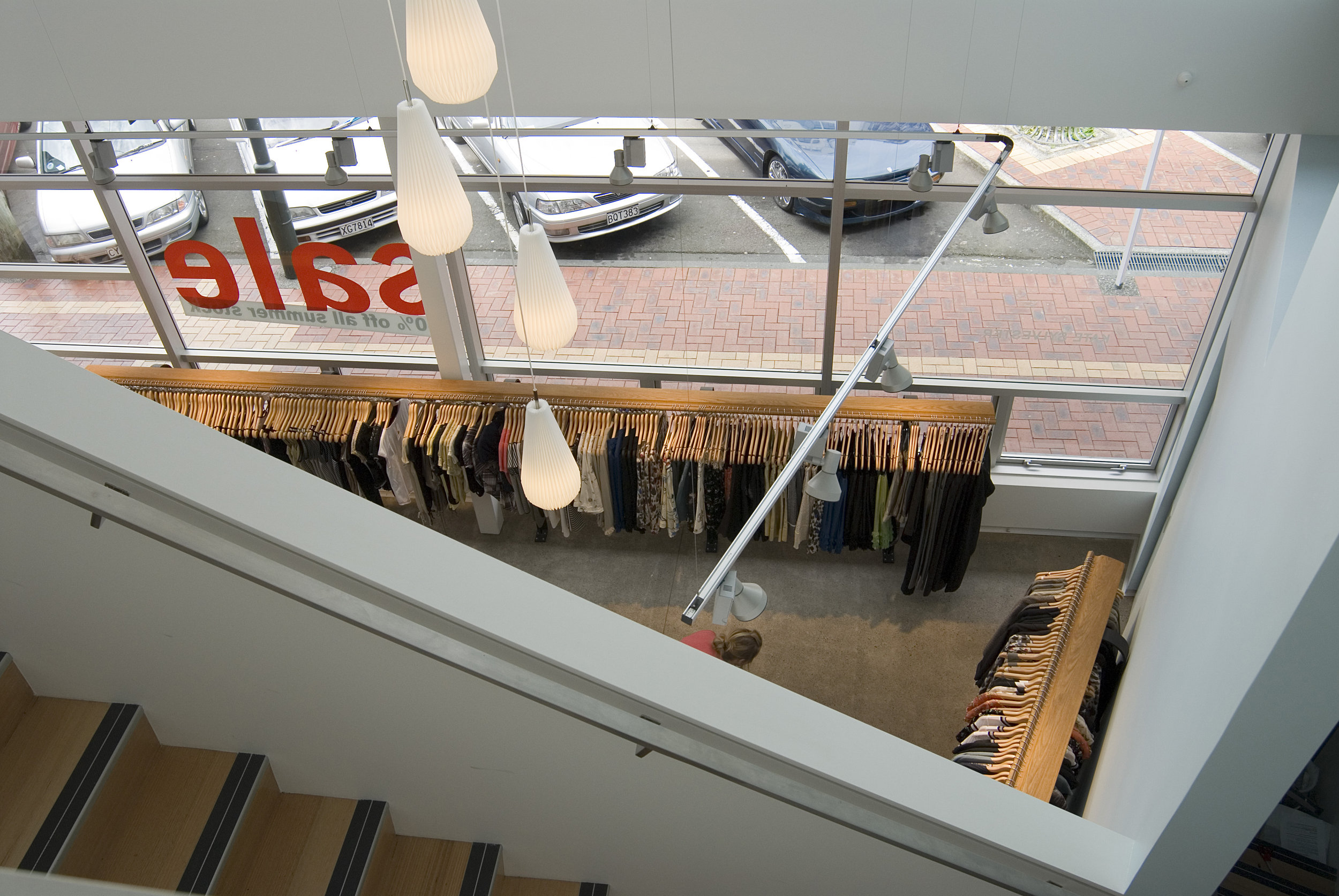
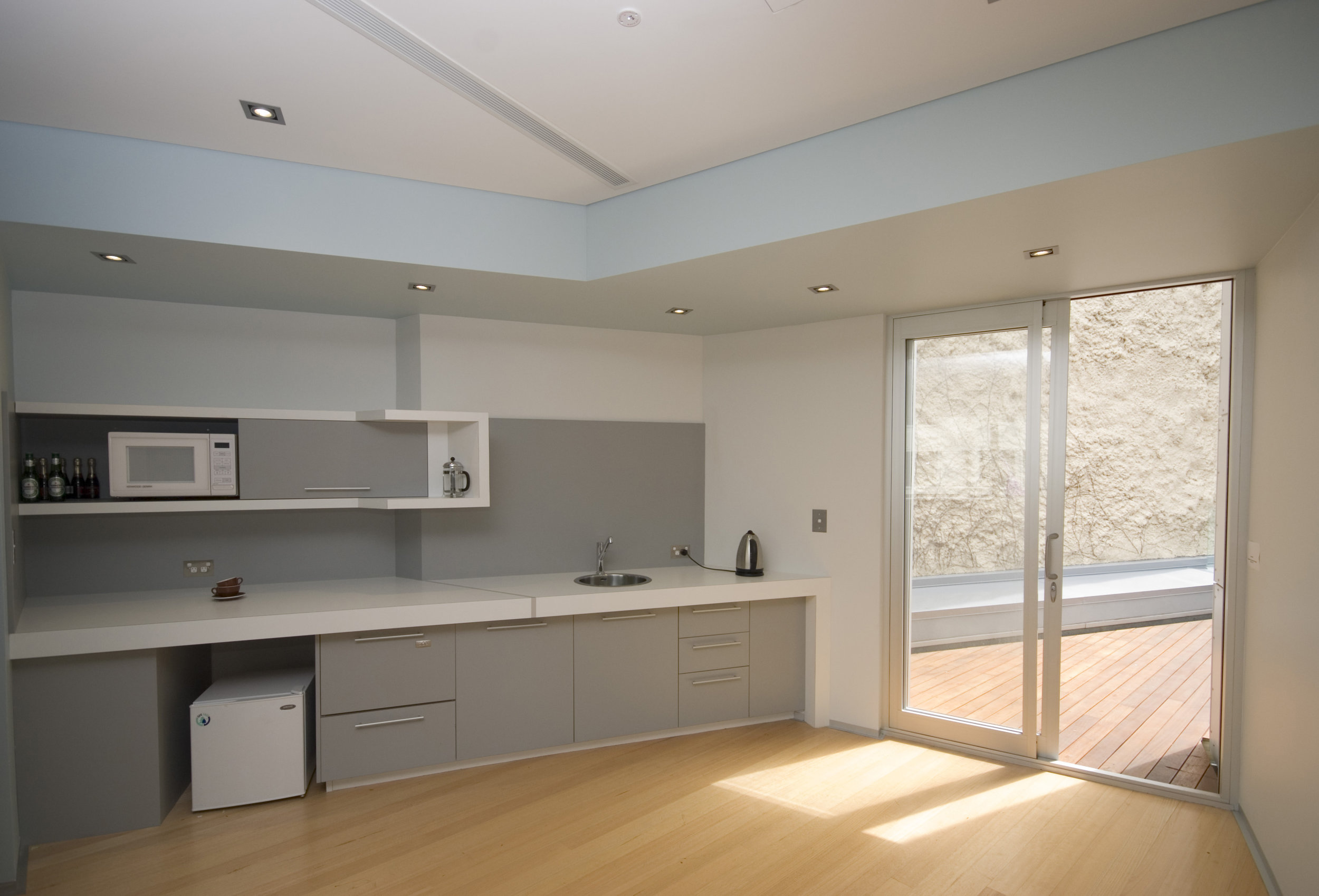
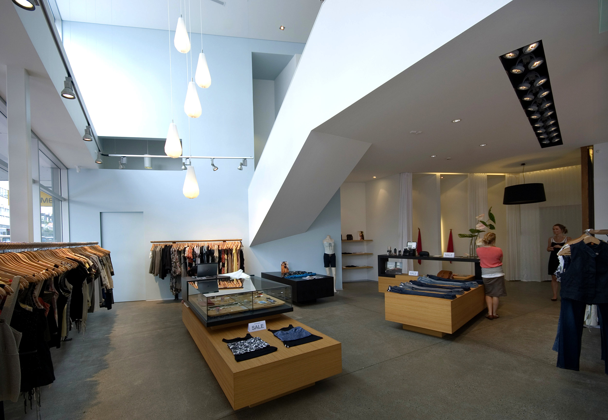
Situated on a small triangular site at the bottom end of Cuba St, the show piece for Kate Sylvester in Wellington presented challenges normally associated with a much denser urban fabric. ArcHaus approached the project quite literally with the idea of folding the retail space into the site. This concept is carried through to the interior, where a double height space accentuates the play on perspective and reinforces the strong lines that make this the ideal retail space for a New Zealand Fashion Icon.
Short listed NZIA - Resene Local Awards 2007
Winner NZIA - Resene Local Awards 2008




armstrong prestige showrooms - wellington
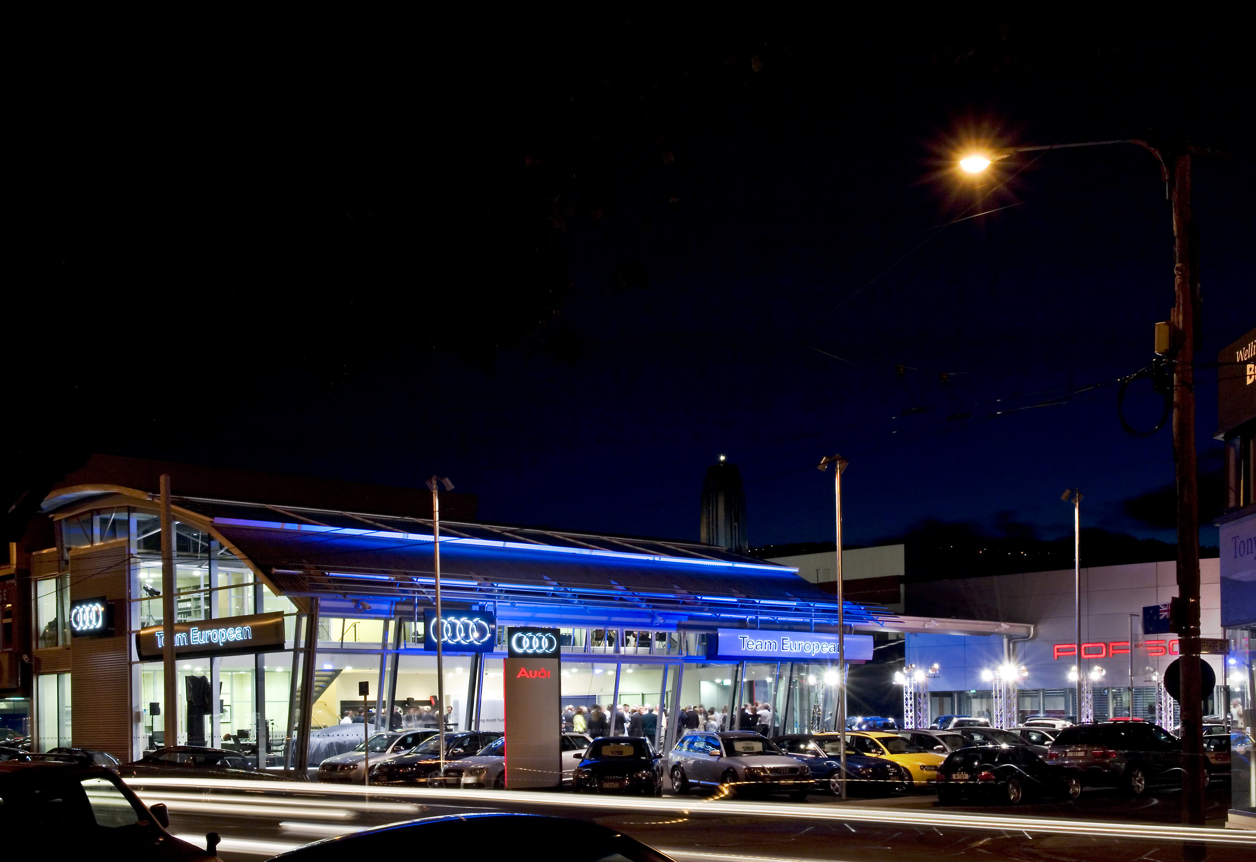
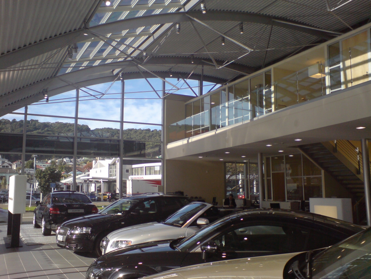
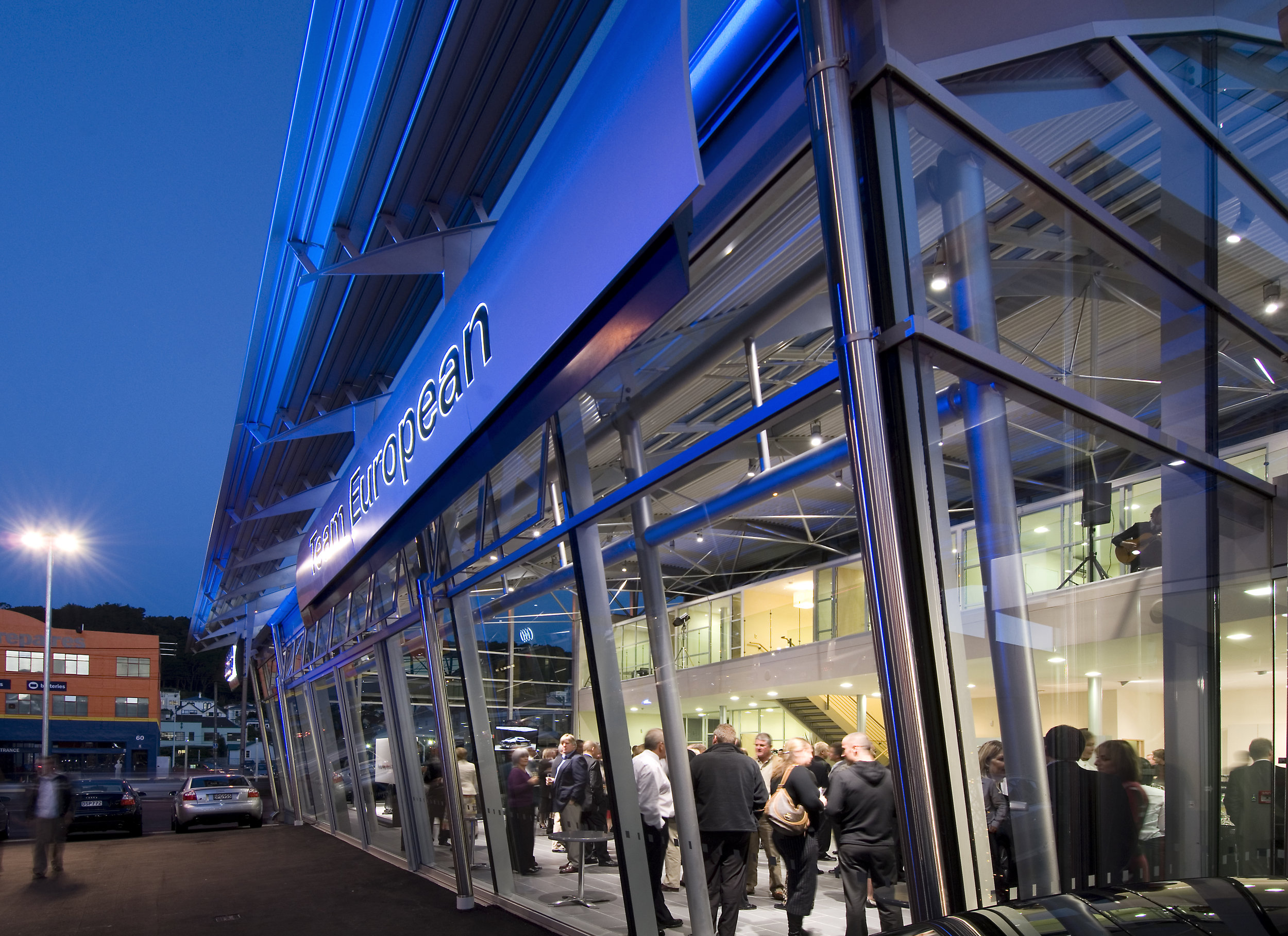
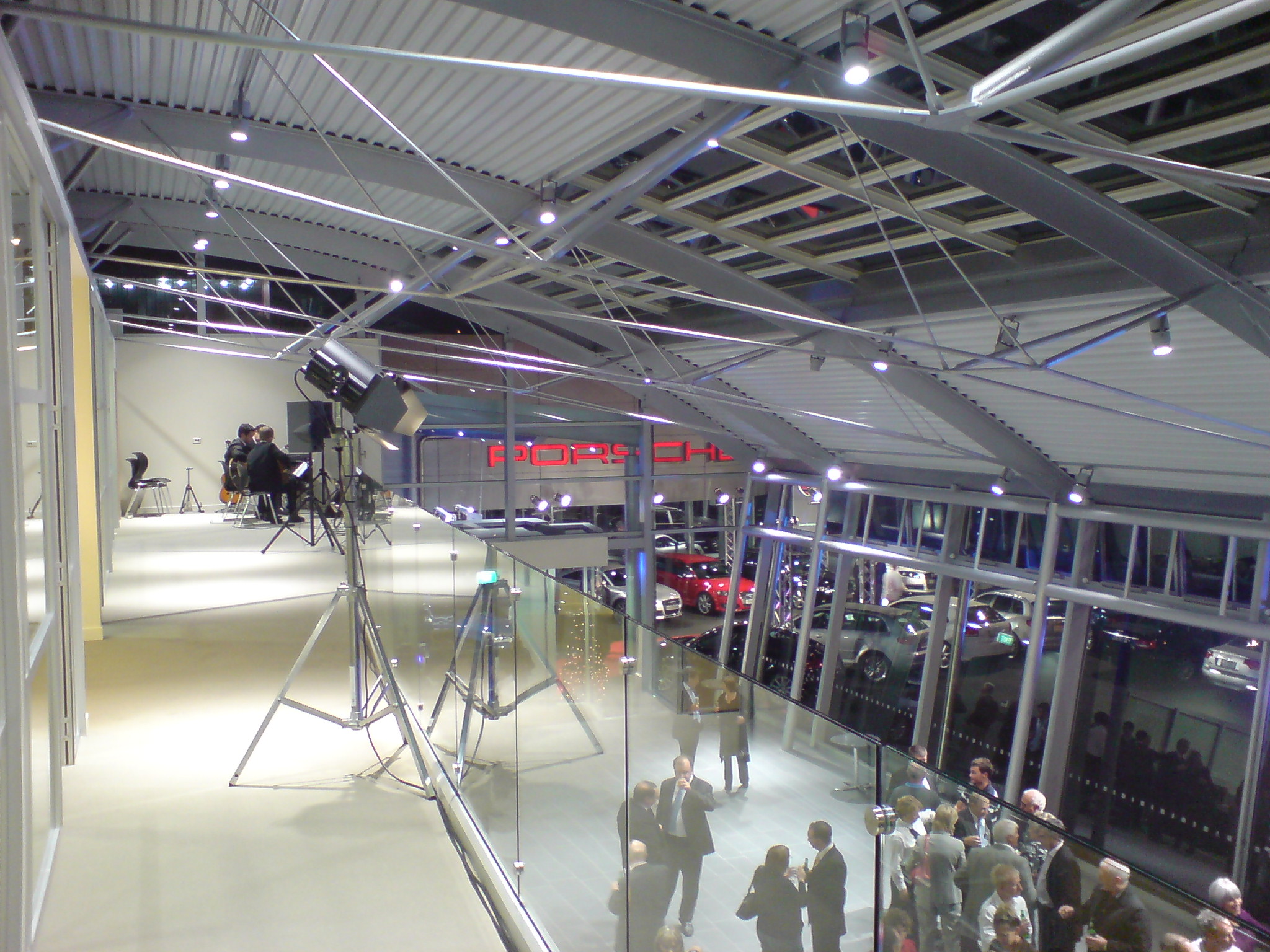
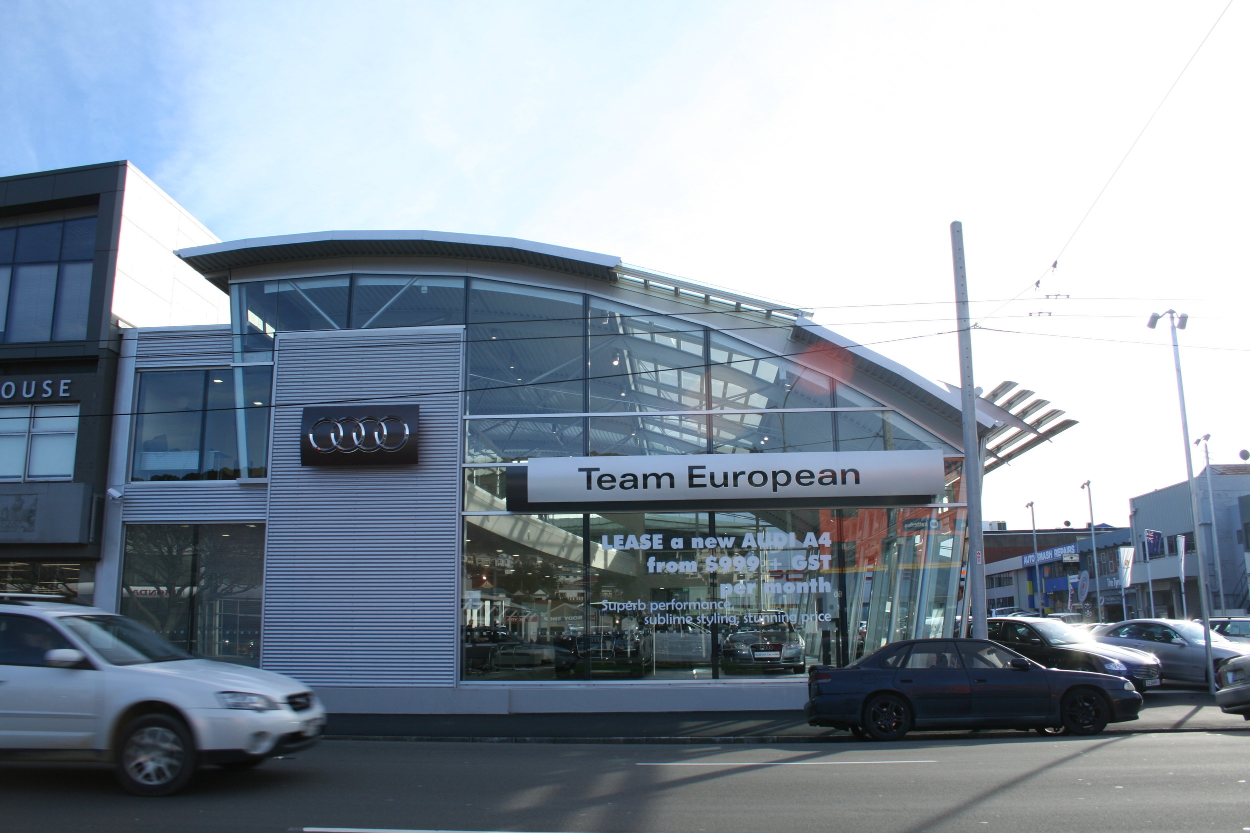
Two new flagship showrooms were required for both Porsche and Audi at 66 Cambridge Terrace, Wellington, furthering Team European's ethos of providing a high quality backdrop for displaying their products.
All Audi products and services are presented in the best possible manner. Audi strive to create a showroom that reflects the joy of innovation and the premium quality of their brand. As a result, all materials and finishes are to the highest quality, conveying a sporty, progressive and sophisticated brand.
Short listed NZIA - Resene Local Awards 2007
Short listed NZIA - Resene Local Awards 2008
the regent - wellington
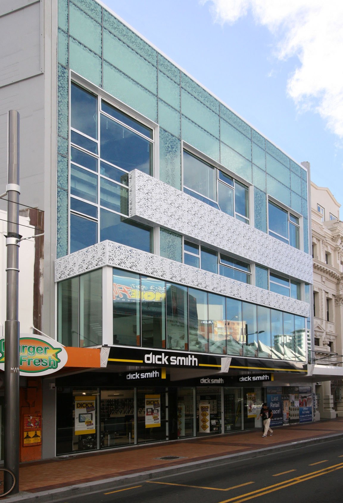
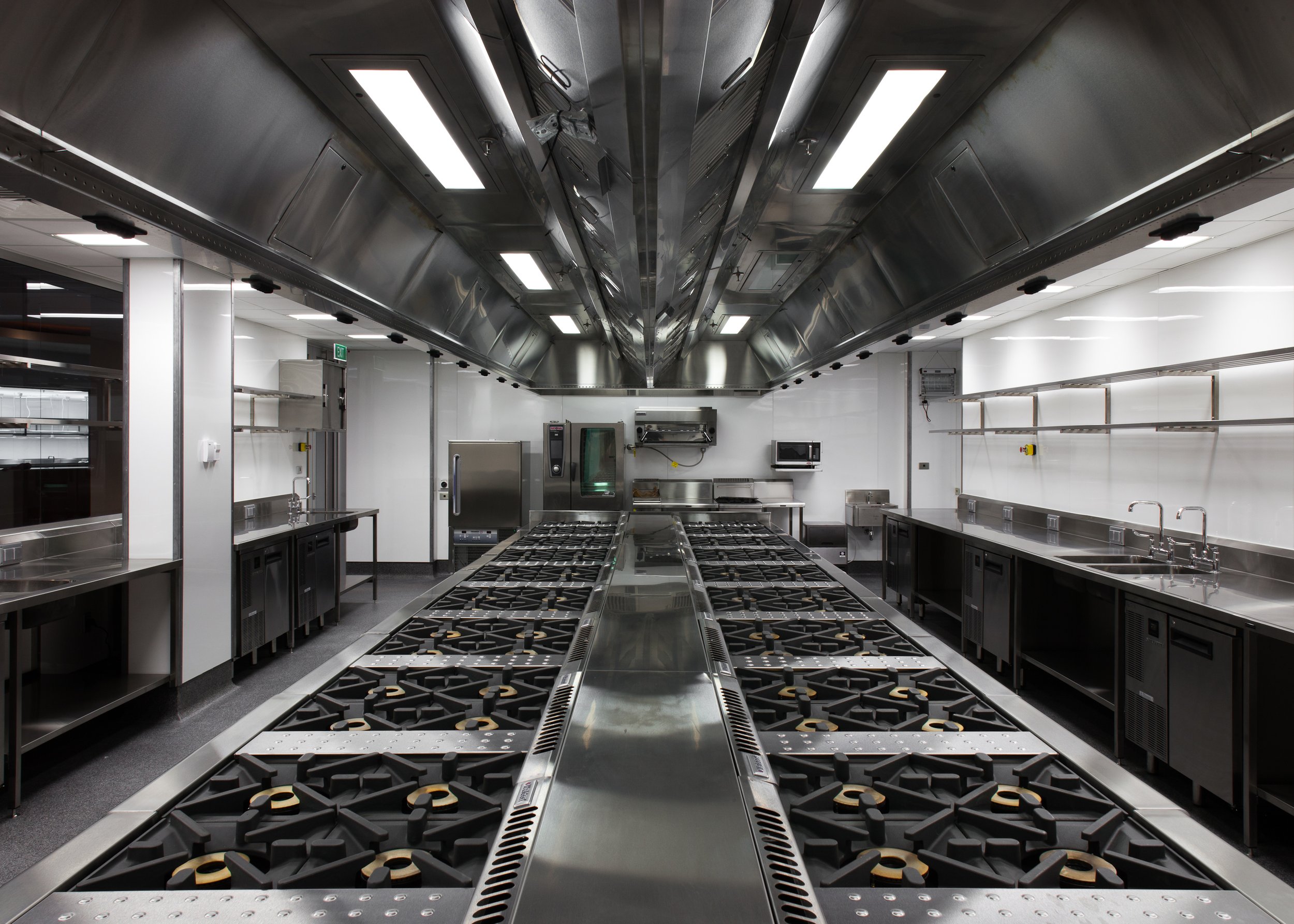
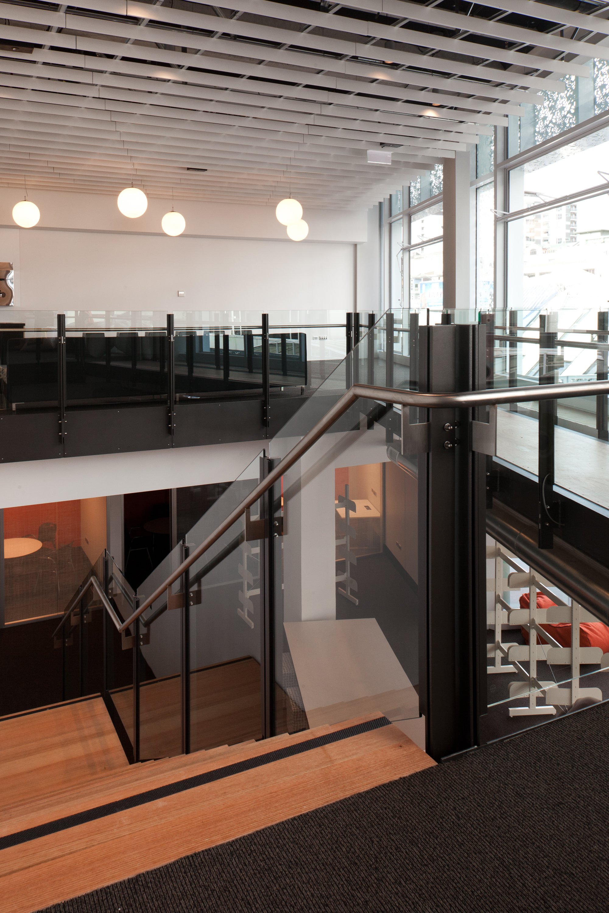
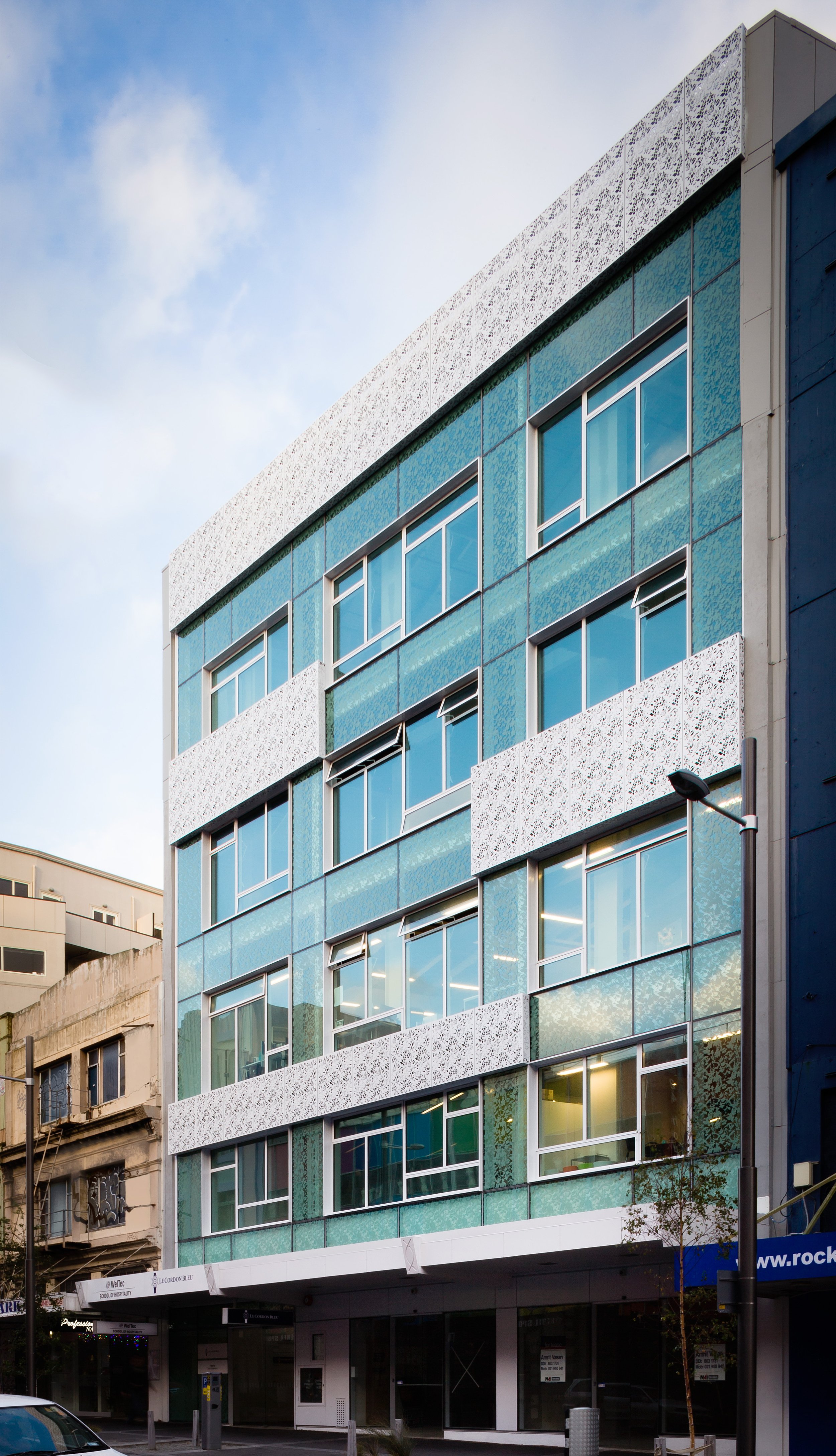
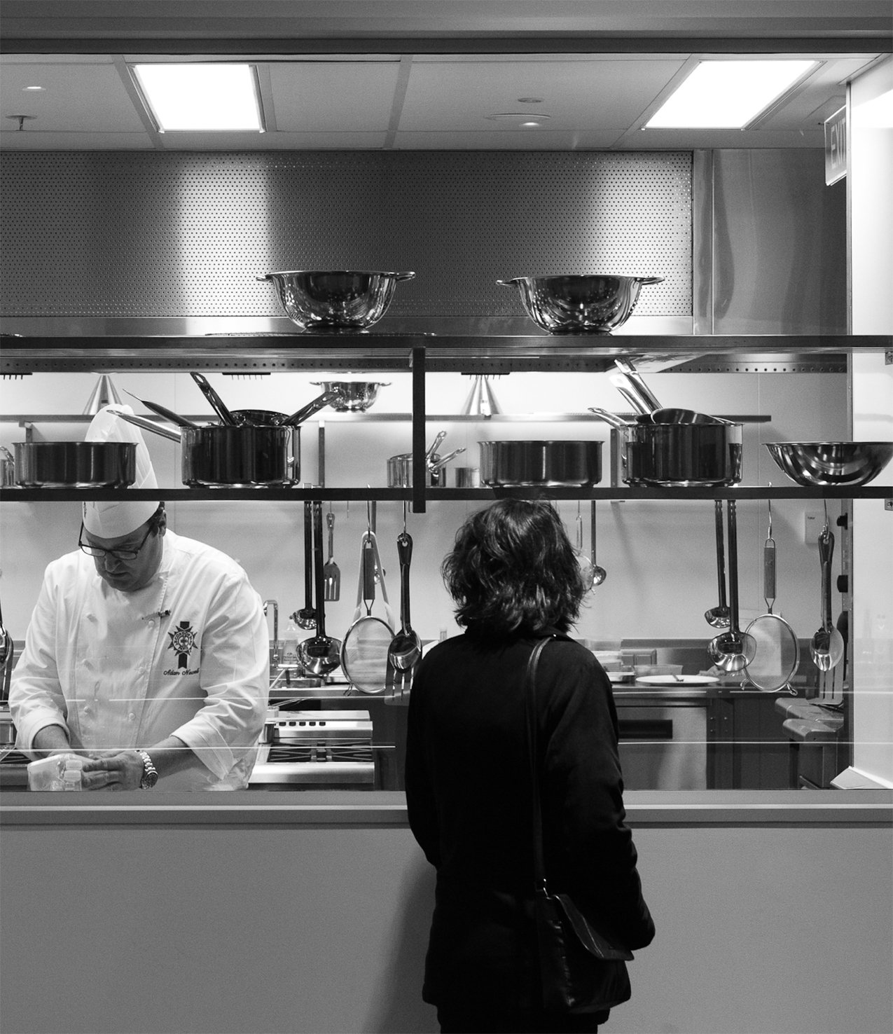
The Regent Centre project completed in July 2012 transformed the existing cinema complex from the 1970s into a state of the art cooking and hospitality school.
The two school’s facilities are split over three and a half floors from level 1 to level 4. The vision of Weltec and Le Cordon Bleu was for Schools of international standard, which would capture the imagination of students both now and for future generations. The joint occupation of both Schools on one site was a unique prospect. Each School offers it’s s own distinctive programmes and learning environment, and the challenge for the design teams was to coordinate the facilities, all the while maintaining the individuality of the brands and services.
The Regent has won two awards since its completion in 2012: the complex took home the Gold Award in the education category for the New Zealand Commercial Projects Awards in 2013; and the Best Adaptive Re-use Award from the Earthquake Strengthening Awards in 2013.
The Regent is was also a finalist for Property Industry Awards for 2013 in both the Education and Arts Property Award and the Heritage Adaptive Re-use Property Award.
The relief created with different precisely detailed parts of the curtain wall facade breaks the large scale of the building and creates an articulated elevation in a contemporary design and materiality. The horizontal and vertical elements pay reference to the neighboring heritage buildings and the pattern on the glass is a contemporary response to pattern found on the historic BNZ building next door.
briscoes & rebel sports family
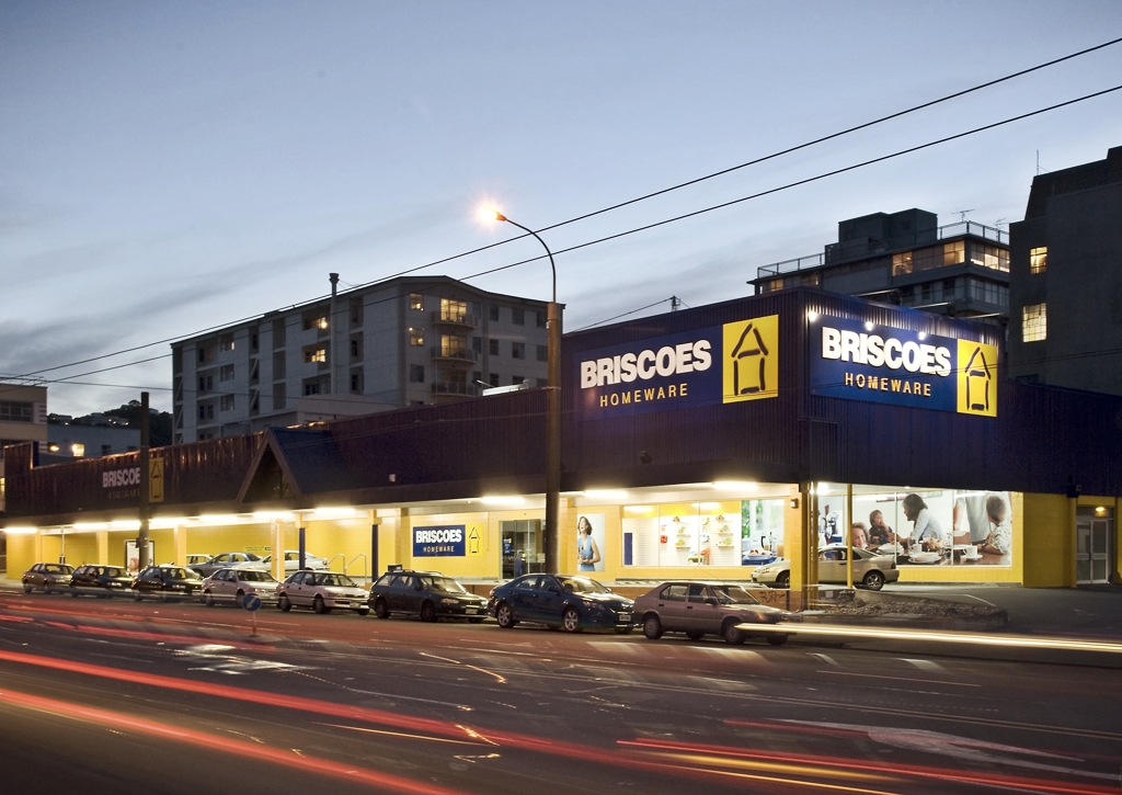
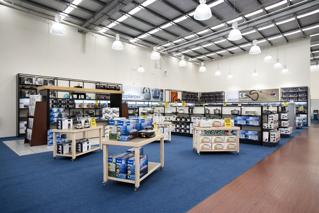
BRISCOES
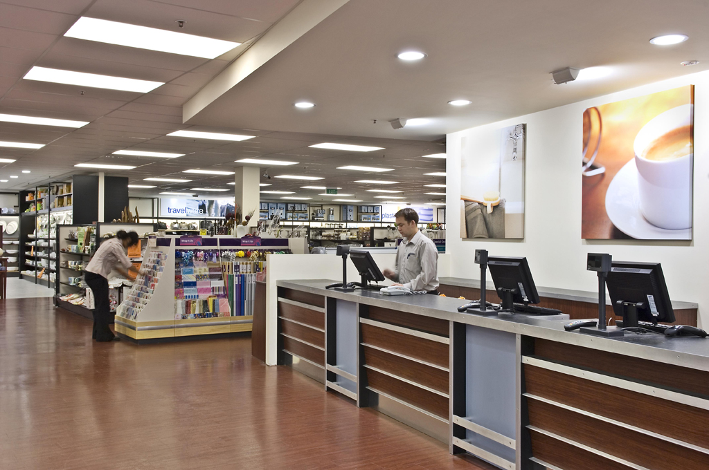
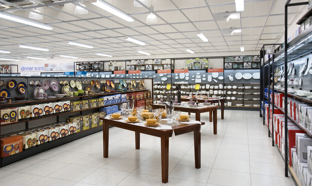
Refreshing the national stores of a major household brand retailer in New Zealand and turning them into a contemporary shopping experience with modern, bright and exciting detailing was a great success for Briscoes Homeware.
This was achieved by specifying new floors finishes, fittings, and colour schemes. The use of lowered ceilings to emphasis certain areas drew shoppers to these areas, and the use of colour within the fittings helped brighten the overall image, while at the same time creating spaces to provide a new shopping experience. The scope involved considers the design of seven store outfits nation-wide and additional building extensions in Wellington and Timaru.
REBEL SPORT
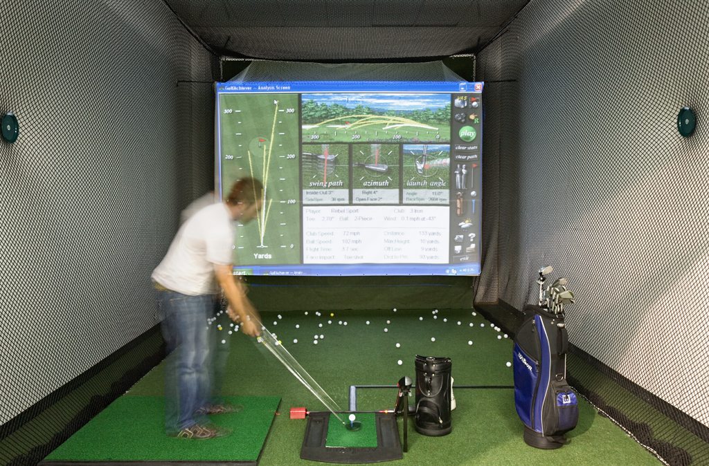
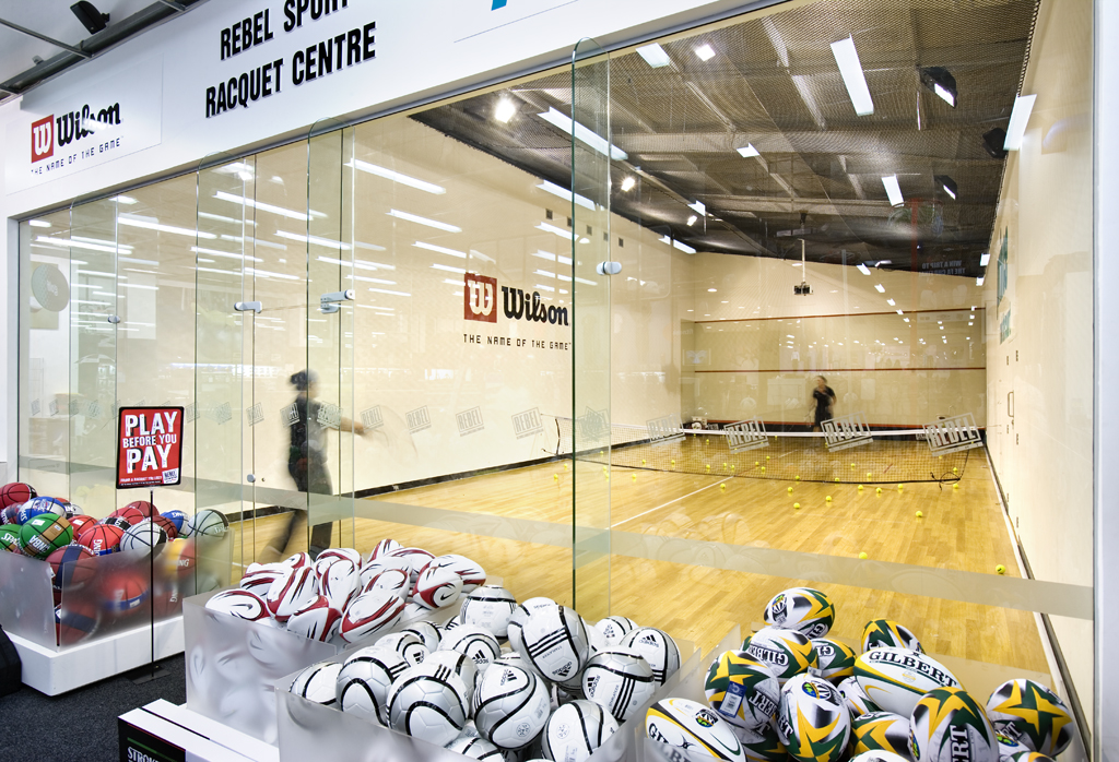
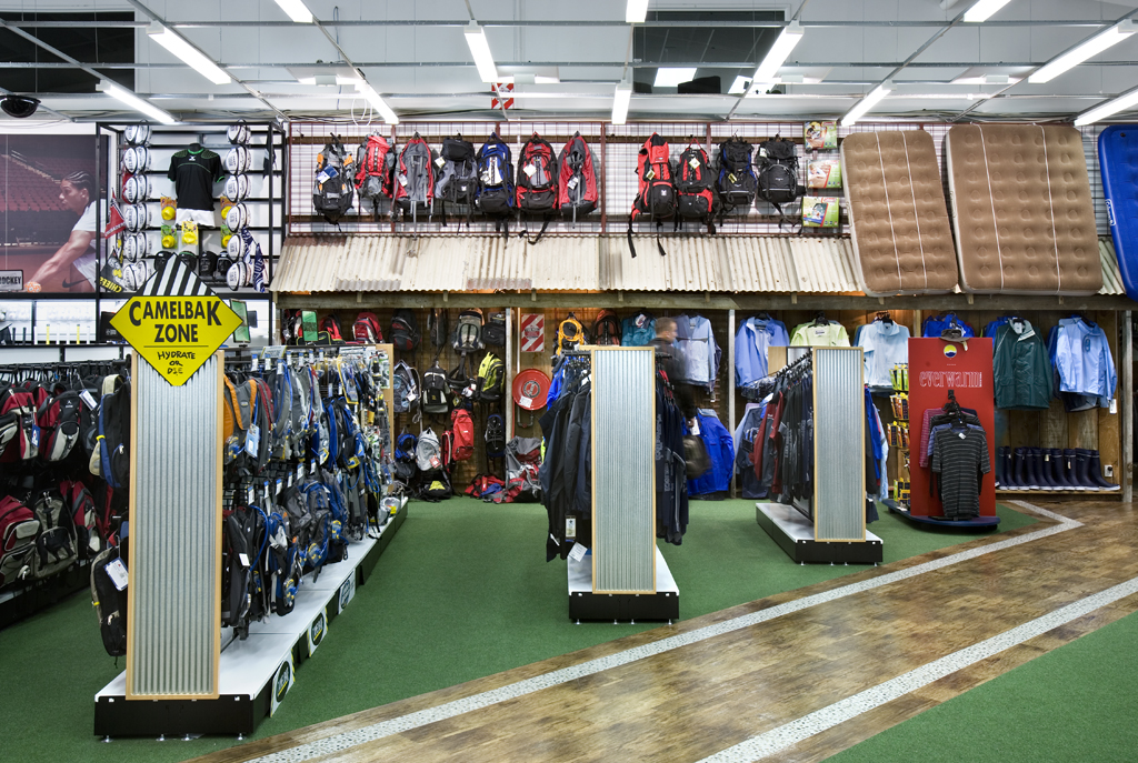
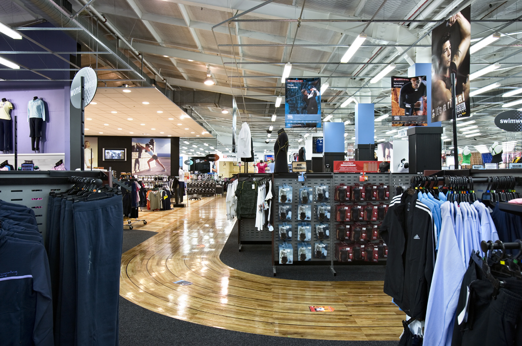
Re-imaging New Zealand's largest sports retailer offers unique opportunities particularly when the client asks for the result to be the best sports store in the southern hemisphere. Archaus took the opportunity and constructed within a tight time frame, with the store still operating, an exciting visual retail experience with utilising colour and impact.
The combination of interactive areas, including a fully digitised computer driving range, a 3/4 size indoor tennis court, large projection screens and video displays, the bold use of colour and moving display panels in addition to the back lighting of graphics created an outcome that exceeded the brief.
